The Ultimate Guide to Funnel Charts in Microsoft Excel: Rich Examples, Expert Tips, and Detailed FAQs
Welcome to the definitive guide on Funnel Charts in Microsoft Excel. If you’re involved in any data-driven field like marketing, sales, or human resources, you know that presenting data in an easily digestible format is half the battle. That’s where funnel charts come in. They are one of the most effective ways to represent data in a sequential, process-driven manner.
Table of Contents
Why Choose Funnel Charts in Microsoft Excel
The Versatility of Funnel Charts
Funnel Charts are an excellent tool for illustrating a series of processes or stages. For example, in sales, they can depict the journey from initial lead acquisition to the closing of a deal. In HR, they can demonstrate the funnel from receiving resumes to the final hiring stage.
Why Excel is Ideal for Funnel Charts
Specialized data visualization software may offer more types of charts and graphs, but Microsoft Excel brings its own advantages to the table. Its widespread availability and ease of use make it a go-to tool for many professionals. Besides, Excel allows for extensive customization, making it a versatile choice for creating funnel charts.
Step-By-Step Guide: How to Create a Funnel Chart in Excel
Step 1: Data Structuring in Excel
First things first—data preparation. Open an Excel worksheet and create two columns. One should list the stages or steps in your process, and the other should have the corresponding values or counts.
Sample Data in Excel:
| Stage | Value |
|————|——–|
| Inquiries | 1000 |
| Engaged | 800 |
| Shortlisted| 500 |
| Finalized | 200 |
| Closed | 100 |
Step 2: Creating Your Funnel Chart
Once your data is ready, you’re set to create your chart:
- Select your data.
- Navigate to the
Inserttab in Excel. - Look for the
Chartssection and select Funnel Chart from the dropdown.
Your funnel chart should now appear in your Excel worksheet. But your work isn’t done yet!
Step 3: Customize Your Funnel Chart
Customizing your Funnel Chart can make it more insightful and easier to understand:
- Add Titles and Subtitles: A clear title will let viewers know the chart’s purpose immediately.
- Insert Data Labels: Right-click on each segment of your funnel chart and add data labels for clarity.
- Color Customization: Modify the color for each stage to make the chart more engaging or to align it with brand colors.
In-Depth Examples: Practical Applications of Funnel Charts
Example 1: Sales Process Funnel
Imagine you’re a sales manager and want to illustrate how 1,000 initial inquiries resulted in 50 closed deals. A funnel chart can beautifully depict this narrowing process. You can even color-code each stage to correspond with your CRM system’s color scheme.
Example 2: Marketing Conversion Rates
If you’re in marketing, a funnel chart can reveal the efficiency of your online marketing efforts. From visitor count to conversion rate, each stage can be visualized to pinpoint areas that may need improvement.
Example 3: HR Recruitment Funnel
HR professionals can use a funnel chart to show the recruitment process, from the number of resumes received to the number of people hired. This can be particularly useful during annual reviews or strategy planning sessions.
Example 4: Customer Journey Funnel
Customer experience managers can create a funnel chart to outline the customer’s journey from awareness to purchase. By looking at the chart, teams can identify potential areas where customers drop off.
Example 5: Product Development Lifecycle
If you’re in product management, a funnel chart can be used to illustrate the phases of product development, from the ideation stage to market release. This chart can help in aligning your team and updating stakeholders.
Pro Tips: Enhance Your Funnel Charts in Excel
Pro Tip 1: Add Percentage Changes
To get even more from your chart, consider adding percentage change labels between each stage. This will provide an additional layer of information and could reveal insightful trends.
Pro Tip 2: Use Conditional Formatting
Although Excel’s native options don’t include conditional formatting for funnel charts, creative use of colors can act as a manual alternative. For instance, you could use red, yellow, and green to indicate stages requiring attention, and caution, or that are performing well, respectively.
Pro Tip 3: Link to Dynamic Data
If you’re dealing with real-time data, consider linking your Funnel Chart to a database. This way, your chart updates automatically when the data changes, providing real-time insights.
FAQs: Your Funnel Charts in Excel Questions Answered
What Versions of Excel Support Funnel Charts?
Funnel charts were introduced in Excel 2016, so if you’re using an older version, you’re out of luck.
How Do I Update My Funnel Chart in Real-Time?
Linking your funnel chart to dynamic, real-time data can be achieved through Excel’s Data Connection features. This is especially useful for dashboards and frequent reporting.
Additional Tools and Resources for Creating Funnel Charts in Excel
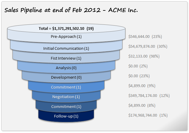
Funnel Charts in Excel
Useful Excel Add-ins
While Excel’s native functionalities are powerful, there are several add-ins to further enhance your experience with funnel charts:
- Chart Creator: This add-in allows for more design options, letting you customize even the most minor details.
- Data Point: This tool helps you link your funnel chart to real-time data sources for dynamic updates.
Online Tutorials and Courses
If you’re looking to master the art of Funnel Chart creation in Excel, you may benefit from some extra help:
- Udemy Courses: Platforms like Udemy offer comprehensive courses on Excel, including how to make advanced funnel charts.
- YouTube Tutorials: For visual learners, YouTube offers numerous video guides to walk you through the process.
- Projectcubicle Excel Tutorials: For learners, Projectcubicle offers numerous Excel blogposts to walk you Excel process.
Books on Data Visualization in Excel
- “Excel Data Visualization: For Dummies”: This book provides an excellent introduction to Excel’s data visualization tools, including funnel charts.
- “Storytelling with Data”: Learn how to tell a compelling story with your data, using tools like funnel charts to effectively communicate complex ideas.
Advanced Tips for Funnel Charts in Excel
Embed Your Funnel Chart into PowerPoint
If you’re creating a presentation, remember you can embed your Excel Funnel Chart directly into PowerPoint. This enables you to present real-time data, as the chart will update in PowerPoint when modified in Excel.
Exporting Your Funnel Chart
Excel allows you to save your funnel chart as an image or PDF. This is particularly useful if you need to share your chart but want to avoid sending the whole Excel file.
Use Macros for Automation
For advanced users, Excel’s macro functionalities can automate various aspects of funnel chart creation, saving you time and effort in the long run.
Conclusion: The Power of Funnel Charts in Microsoft Excel
Creating Funnel Charts in Microsoft Excel is a valuable skill for anyone dealing with sequential, process-oriented data. The ability to visualize and present this kind of data effectively can be a game-changer in your professional journey. This guide gives you all the tools you need to create compelling and insightful Funnel Charts in Microsoft Excel. With step-by-step instructions, multiple examples, pro tips, and answers to frequently asked questions, you’re now fully equipped to make the most of this powerful Excel feature.
Remember, a well-executed Funnel Chart doesn’t just display data; it tells a compelling story. So start crafting your own funnel charts and tell your story like never before!
Hello, I’m Cansu, a professional dedicated to creating Excel tutorials, specifically catering to the needs of B2B professionals. With a passion for data analysis and a deep understanding of Microsoft Excel, I have built a reputation for providing comprehensive and user-friendly tutorials that empower businesses to harness the full potential of this powerful software.
I have always been fascinated by the intricate world of numbers and the ability of Excel to transform raw data into meaningful insights. Throughout my career, I have honed my data manipulation, visualization, and automation skills, enabling me to streamline complex processes and drive efficiency in various industries.
As a B2B specialist, I recognize the unique challenges that professionals face when managing and analyzing large volumes of data. With this understanding, I create tutorials tailored to businesses’ specific needs, offering practical solutions to enhance productivity, improve decision-making, and optimize workflows.
My tutorials cover various topics, including advanced formulas and functions, data modeling, pivot tables, macros, and data visualization techniques. I strive to explain complex concepts in a clear and accessible manner, ensuring that even those with limited Excel experience can grasp the concepts and apply them effectively in their work.
In addition to my tutorial work, I actively engage with the Excel community through workshops, webinars, and online forums. I believe in the power of knowledge sharing and collaborative learning, and I am committed to helping professionals unlock their full potential by mastering Excel.
With a strong track record of success and a growing community of satisfied learners, I continue to expand my repertoire of Excel tutorials, keeping up with the latest advancements and features in the software. I aim to empower businesses with the skills and tools they need to thrive in today’s data-driven world.
Suppose you are a B2B professional looking to enhance your Excel skills or a business seeking to improve data management practices. In that case, I invite you to join me on this journey of exploration and mastery. Let’s unlock the true potential of Excel together!
https://www.linkedin.com/in/cansuaydinim/


