Power BI Treemap Example: What is The Use of Treemap?
Treemaps in Power BI are more than just a tool; they’re a canvas for data storytelling, offering a vibrant and intuitive way to visualize hierarchical structures. This guide takes you on an exploratory journey through the Power BI Treemap, illustrating its capabilities, nuances, and how it complements other Power BI features like Power BI Treemap multiple values, Power BI Treemap top 10, Power BI Treemap wrap text, Power BI Treemap drill down, alongside visuals such as funnel in Power BI and gauge Power BI. Prepare to unlock a new level of data insight.
Table of Contents
Power BI Treemap offers a visually engaging way to represent hierarchical data, making it easier for analysts and business users to unearth patterns and insights. This guide dives deep into utilizing Power BI Treemap effectively, including incorporating multiple values, focusing on top 10 insights, implementing Power BI Treemap wrap text for clarity, exploiting drill-down functionality for detailed analysis, and more.
What is the Use of Treemap?
Well, what is the use of treemap in power bi? Imagine you’re a pirate, and your treasure is data. Your map? The Power BI Treemap. This visualization tool is your best mate when it comes to displaying data in a way that’s as easy to understand as spotting a parrot in a pet store. It breaks down hierarchies into colorful rectangles, making it easier to spot which sales region is hoarding the gold and which one’s walking the plank.
Treemap vs. Pie Chart in Power BI
Choosing between a Treemap and a pie chart is like deciding between a speedboat and a yacht for your next pirate adventure. The pie chart might look fancy and straightforward with its simple slices, but it quickly becomes as crowded as a popular pirate bar on Friday night with too many categories. The Power BI Treemap, on the other hand, is the speedboat: sleek, efficient, and perfect for navigating through complex data seas with ease.
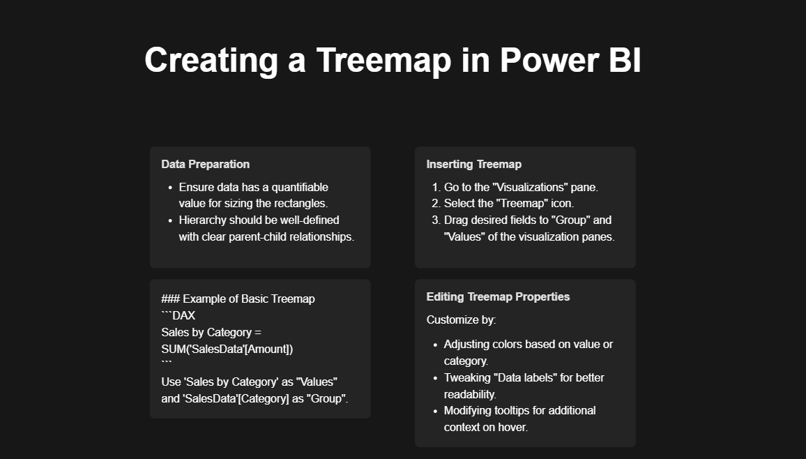
creating-treemap-in-powerbi
Treemap vs. Heat Map in Power BI
Now, if the Treemap is a speedboat and the pie chart is a yacht, the heat map is the submarine of data visualization. While Treemaps organize data in neat, colorful rectangles, heat maps dive deep, using colors to show patterns within a dataset—ideal for spotting where X marks the spot on your data treasure map.
The Ultimate Guide to a Power BI Career: How to Learn Power BI? – projectcubicle
Quick Part: Creating a Power BI Treemap
Creating a Treemap in Power BI is as easy as a pirate finding rum at a port. Here’s a quick guide, no treasure map needed:
- Open your Power BI dashboard, matey.
- Select your dataset; let’s say it’s “Sales by Region.”
- From the Visualizations pane, choose the Treemap icon—it looks like a bunch of squares trying to cuddle.
- Assign “Region” to Groups and “Sales” to Values.
- Watch as Power BI magically transforms your data into a colorful Treemap.
Note: If your Treemap looks more like a kraken than a visualization, check your data categories and values.
Step-by-Step Guide to Creating a Power BI Treemap
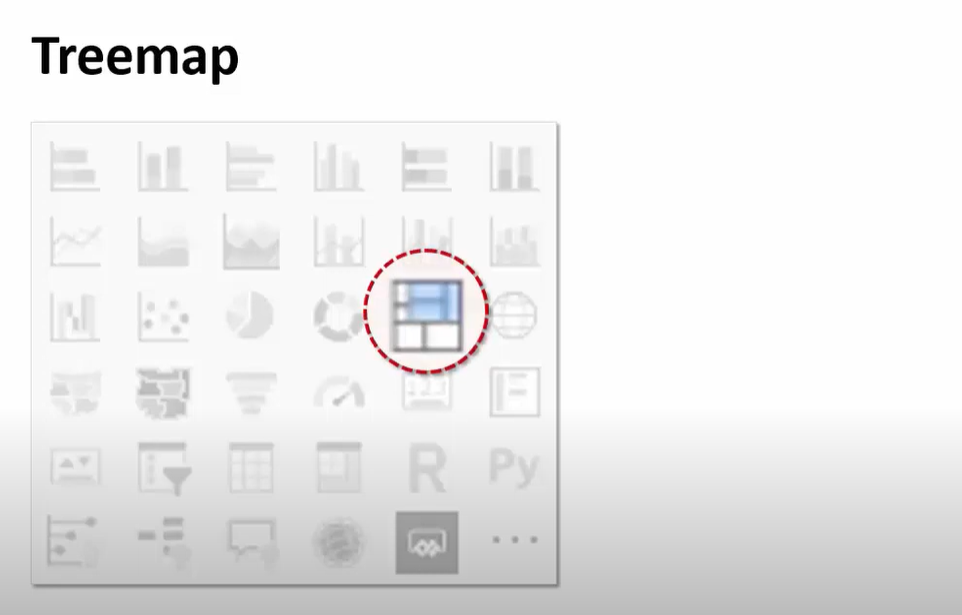
Step 1 Find Treemap in Power BI
1. Prepare Your Data: First, ensure your dataset includes at least three key elements: regions, product categories, and sales figures. For this example, your dataset might look something like this:
- Region: North America, Europe, Asia
- Product Category: Electronics, Apparel, Home Goods
- Sales Figures: Various dollar amounts representing sales volume
2. Load Your Data into Power BI: Open Power BI and import your dataset. You can use Excel, CSV files, or directly connect to your company’s database.
3. Create a Treemap Visualization:
- In the Power BI interface, select the “Treemap” from the Visualizations pane.
- Drag the “Region” field to the “Group” section of the Treemap to set the top-level categories.
- Next, drag the “Product Category” field to the “Details” section. This action nests the product categories within each region.
- Finally, drag the “Sales Figures” field to the “Values” section. This step sizes each rectangle within the Treemap according to the sales figures.
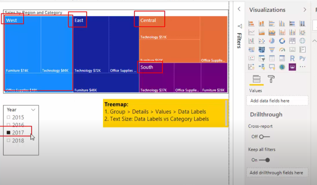
Step 2 Add Gorup Labels
4. Customize Your Treemap:
- Adjust colors to differentiate between regions or product categories more clearly.
- Use the “Format” options to add labels, adjust the text size, or change the Treemap’s background color for better readability.
5. Analyze Your Data: With your Treemap visualization complete, you can now easily analyze sales performance across regions and product categories. Larger rectangles indicate higher sales figures, allowing you to quickly identify which areas are excelling or underperforming. The color differentiation further aids in this analysis by visually segmenting different regions or product categories.
Example Insights:
- Region Performance: The Treemap reveals that North America has the largest rectangles, indicating it’s the top-performing region in terms of sales.
- Product Category Analysis: Within the North America region, the Electronics category has the largest rectangle, suggesting it’s the best-selling product category.
- Areas for Improvement: Smaller rectangles, such as the Apparel category in Asia, highlight areas where sales may be lagging and could benefit from targeted marketing efforts.
In the visually driven world of Power BI, the Power BI Treemap wrap text feature stands out as a small yet significant tool in enhancing the readability and overall aesthetic of your Treemaps. This feature ensures that labels within your Treemap are neatly contained within each rectangle, wrapping text so that it remains visible and legible, no matter the size of the block. The Power BI Treemap wrap text functionality is particularly valuable when dealing with lengthy labels that represent complex datasets, making it a crucial component in the creation of clear, informative Treemaps.
The Importance of Power BI Treemap Wrap Text
- Enhanced Readability: The primary benefit of the Power BI Treemap wrap text feature is its impact on readability. By preventing labels from being cut off or overflowing, it ensures that each piece of data can be easily identified at a glance, enhancing the user’s ability to quickly comprehend the information presented.
- Improved Aesthetics: Treemaps, by their nature, are visually appealing. The addition of the Power BI Treemap wrap text feature contributes to this aesthetic by maintaining a clean and organized look, where every label fits neatly into its designated rectangle.
- Increased Accessibility: For audiences that may include individuals with visual impairments or those who are not data-savvy, the Power BI Treemap wrap text feature makes data more accessible. Well-organized and legible labels help in making the data understandable to a wider audience.
- Customization and Flexibility: The Power BI Treemap wrap text feature offers a degree of customization, allowing users to adjust the text size and wrapping to fit the unique needs of their dataset and visualization goals. This flexibility ensures that the Treemap remains an effective tool for data storytelling, regardless of the complexity or length of the labels used.
- Data Integrity: Lastly, the Power BI Treemap wrap text feature helps in preserving the integrity of the data. By ensuring that labels are fully visible and not truncated, it guarantees that the information is accurately represented and understood, preventing misinterpretation or loss of critical data points.
Power BI Treemap Multiple Values
In the realm of data visualization within Power BI, the ability to display Power BI Treemap multiple values significantly amplifies the analytical power of Treemaps. This feature allows users to represent two dimensions of data simultaneously: one through the size of the rectangles and another through their color intensity. This dual representation makes Treemaps an incredibly versatile tool for data analysis, providing a depth of insight that is both visually compelling and easy to interpret.
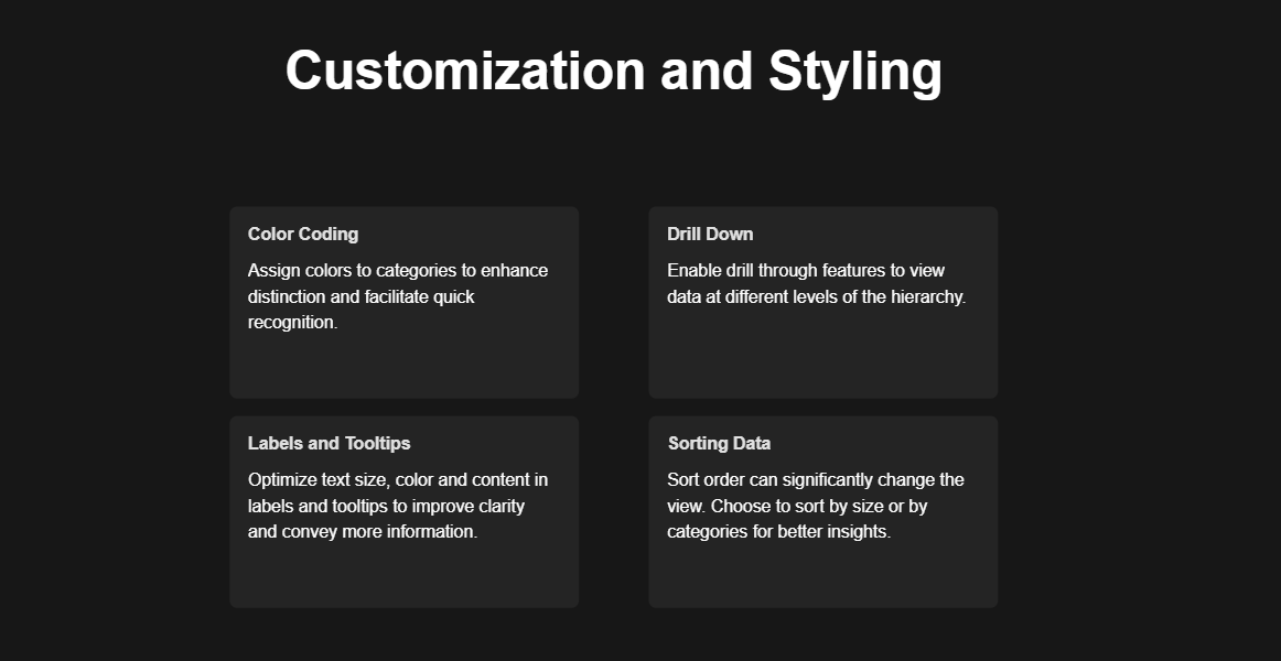
customization of treemap power bi
The Power BI Treemap multiple values feature excels in scenarios where understanding the relationship between different metrics for the same dataset is crucial. For instance, in a sales analysis scenario, not only can the size of the rectangles represent the total sales volume by region, but the color saturation can also indicate the profitability of those sales. This dual-layered approach enables analysts to quickly identify which regions are not only high performers in terms of volume but also in terms of profitability, highlighting areas of strategic importance.
Furthermore, the Power BI Treemap multiple values functionality facilitates a comparative analysis across multiple categories or time periods within a single visual frame. Users can assess the performance of various products, departments, or regions, not just on a single metric but across multiple parameters, enabling a more nuanced understanding of their data. This is particularly useful in resource allocation and strategic planning, where multiple factors influence decision-making processes.
The customization options available within Power BI Treemap multiple values also allow for tailored visualizations that meet specific analytical needs. Users can adjust the color scales to differentiate more clearly between high and low values, enhancing the visual impact and readability of the Treemap.
Why Use TreeMap Instead of Pie Chart?
Using a Treemap over a pie chart is like choosing a compass over a guessing game when navigating. Treemaps can handle more data without making you feel like you’re trying to read the fine print on a pirate’s contract. Plus, they show hierarchical data, which pie charts can’t, making them the go-to for any data-savvy pirate.
Does TreeMap Allow Duplicates?
Ah, the age-old question: can you have two identical islands on a treasure map? In the world of Power BI Treemap, while each rectangle (island) must represent a unique category (no two islands with the same name), you can have values (treasures) that are duplicates. It’s like having two islands with different names but the same amount of buried treasure.
Are Treemaps Better Than Pie Charts?
It’s like asking if a compass is better than a sextant. Both have their uses, but Treemaps, with their ability to display more data and hierarchical information, are often the better choice for the modern data pirate.
Alternative to Treemaps Power BI
When navigating the vast ocean of data visualization, while Power BI Treemap charts are a stellar choice for displaying hierarchical data and part-to-whole relationships, there are several alternative visualization tools at your disposal, each with its unique strengths and use cases. Let’s explore these alternatives, ensuring your data storytelling is as rich and diverse as the world’s cuisines.
Sunburst Charts
Think of sunburst charts as the Treemap’s circular cousin. They’re perfect for visualizing hierarchical data with a bit of a twist—literally. Sunburst charts display data in concentric circles, allowing viewers to understand the hierarchy at a glance. It’s like slicing into a layered cake, where each layer and slice represent different levels and categories of your data. This format can be particularly engaging for audiences who prefer a radial and visually distinct representation.
Stacked Bar Charts
Stacked bar charts are the reliable old ships of the data visualization sea. They work by stacking different data segments on top of each other within bars, making it easy to compare total bar lengths while also breaking down the composition of each bar. Imagine stacking different flavored layers of a cake on top of each other; you can see the whole cake’s size and get a taste of its individual layers. This makes stacked bar charts excellent for comparing total values across categories while also showing the contribution of each part to the whole.
Waterfall Charts
Waterfall charts are the cascading waterfalls of the data visualization world. They’re particularly useful for understanding the sequential contribution of various elements to a final value. Starting with an initial value, each category’s effect is added or subtracted, leading to a final value, much like following the flow of water as it cascades down, adding and subtracting streams. It’s a great way to visualize financial data, such as profit and loss statements, or to track any dataset that involves incremental changes.
Heat Maps
Heat maps are the cozy campfires of data visualization, where colors represent values, allowing you to quickly spot trends, outliers, and patterns based on color intensity. Imagine a quilt where each patch’s color depth represents different data intensities; warmer colors might indicate higher values, and cooler colors, lower values. Heat maps are particularly effective for comparing data across two categories and are widely used in areas such as website analytics, where understanding user behavior across different sections of a page is crucial.
Bubble Charts
Bubble charts take the scatter plot and turn up the volume by adding a third dimension—bubble size—to represent additional data values. Think of it as a party where each guest (data point) has a bubble. The position of the guest tells you about their preferences (x and y axes), and the size of their bubble tells you about their importance or impact. Bubble charts are fantastic for displaying three dimensions of data and can be particularly engaging when you want to highlight the magnitude of data points in relation to each other.
Chord Diagrams
Chord diagrams are the intricate spider webs of data visualization, showing relationships between different entities in a circular layout. Each entity is a point on the circle, and chords (lines) connecting these points represent relationships or flows between them. It’s like looking at a roundabout where each road is a relationship and the roundabout itself represents the whole system. Chord diagrams are excellent for visualizing complex interrelationships, such as migration patterns, trade flows, or social networks.
Choosing the Right Visualization
Selecting an alternative to Power BI Treemap boils down to understanding your data’s story and your audience’s preferences. Whether it’s the layered insights of a sunburst chart, the comparative clarity of stacked bar charts, or the relationship intricacies revealed by chord diagrams, each visualization tool has its unique way of bringing data to life. Like choosing the right dish for a meal, the key is to match the visualization to the occasion, ensuring your data not only informs but also engages and delights your audience.
What Heat Map Means?
A heat map is the treasure chest of data visualization. It uses colors to show data density or intensity, turning a boring table into a vibrant treasure map. It’s perfect for when you want to quickly see which regions are hot (high sales) and which are as cold as a pirate’s heart (low sales).
Setting Sail with Power BI Treemap
As we close our treasure chest of knowledge, remember that Power BI Treemap, with its ability to navigate complex data seas, stands as a mighty tool in your visualization arsenal. Whether you’re charting courses through hierarchical data, comparing regions with pie charts, or diving deep with heat maps, Power BI holds the key to unlocking your data’s true potential.
Now, go forth, ye data pirates, and conquer the seas of information with your newfound knowledge and a hearty “Arrr!”
Creating Compelling Narratives with Power BI Treemap
The Power BI Treemap visual is a storytelling marvel. It’s designed to display hierarchies through nested rectangles, where each rectangle’s size and color represent quantitative and qualitative dimensions, respectively. For instance, consider a dataset detailing global sales by product category. A Treemap could illustrate this by assigning larger rectangles to higher-revenue categories, with color gradients indicating profitability. This visual hierarchy makes it immediately apparent which categories are top performers and which might need a closer look.
Mastering Multiple Values in Treemaps
The ability to display Power BI Treemap multiple values transforms a simple visualization into a multidimensional analysis tool. Imagine a scenario where a business wants to analyze sales data by region and by product category simultaneously. By configuring the Treemap to display regions as the main categories (represented by the size of the rectangles) and product categories as color variations, analysts can quickly discern which regions and products are driving the business’s success. Here’s a snippet of how you might set this up:
"Visuals": {

"Type": "Treemap",

"DataFields": {

"Group": "Region",

"Details": "Product Category",

"Values": "Sales Volume",

"ColorSaturation": "Profit Margin"

}

}
Conclusion: Power BI Treemap as Your Data Visualization Ally
The Power BI Treemap stands as a formidable ally in the data visualization landscape. Its capacity to distill complex hierarchical data into easily digestible, colorful rectangles makes it an essential tool for any data enthusiast. With the Power BI Treemap multiple values feature, it transcends traditional visualization methods, allowing for a nuanced analysis across multiple dimensions. This feature not only enhances the visual appeal of the Treemap but also deepens the level of insight one can derive from the data.
For the readers of ProjectCubicle, delving into the world of Power BI Treemap offers a unique opportunity to enhance your data visualization skills and bring a new level of sophistication to your projects. Whether you’re a seasoned analyst or just starting, the Treemap’s blend of simplicity, depth, and customization is a game-changer.
Hello, I’m Cansu, a professional dedicated to creating Excel tutorials, specifically catering to the needs of B2B professionals. With a passion for data analysis and a deep understanding of Microsoft Excel, I have built a reputation for providing comprehensive and user-friendly tutorials that empower businesses to harness the full potential of this powerful software.
I have always been fascinated by the intricate world of numbers and the ability of Excel to transform raw data into meaningful insights. Throughout my career, I have honed my data manipulation, visualization, and automation skills, enabling me to streamline complex processes and drive efficiency in various industries.
As a B2B specialist, I recognize the unique challenges that professionals face when managing and analyzing large volumes of data. With this understanding, I create tutorials tailored to businesses’ specific needs, offering practical solutions to enhance productivity, improve decision-making, and optimize workflows.
My tutorials cover various topics, including advanced formulas and functions, data modeling, pivot tables, macros, and data visualization techniques. I strive to explain complex concepts in a clear and accessible manner, ensuring that even those with limited Excel experience can grasp the concepts and apply them effectively in their work.
In addition to my tutorial work, I actively engage with the Excel community through workshops, webinars, and online forums. I believe in the power of knowledge sharing and collaborative learning, and I am committed to helping professionals unlock their full potential by mastering Excel.
With a strong track record of success and a growing community of satisfied learners, I continue to expand my repertoire of Excel tutorials, keeping up with the latest advancements and features in the software. I aim to empower businesses with the skills and tools they need to thrive in today’s data-driven world.
Suppose you are a B2B professional looking to enhance your Excel skills or a business seeking to improve data management practices. In that case, I invite you to join me on this journey of exploration and mastery. Let’s unlock the true potential of Excel together!
https://www.linkedin.com/in/cansuaydinim/


![Power BI Slicers Complete Guide Best Practices [2024]](https://www.projectcubicle.com/wp-content/uploads/2024/03/Power-BI-Slicers-Complete-Guide-Best-Practices-2024-480x270.png)
