Unlock the Power of Data: 11 Easy Steps to Learn Power BI and Create a Dashboard in Power BI
Dive into the comprehensive guide on how to Learn Power BI and Create a Dashboard in Power BI. From data integration to visualization, we’ve got you covered!
Table of Contents
Introduction
In today’s data-driven world, the need to distill vast amounts of information into actionable insights is more pressing than ever. Enter Power BI—a versatile tool that lets you turn your data into visual stories. Whether you’re a data analyst, a business leader, or someone who just loves messing around with numbers, learning how to create a dashboard in Power BI can skyrocket your data analysis skills. This comprehensive guide will walk you through everything you need to know to become proficient in Power BI.
Learn Power BI: Create a Dashboard in Power BI
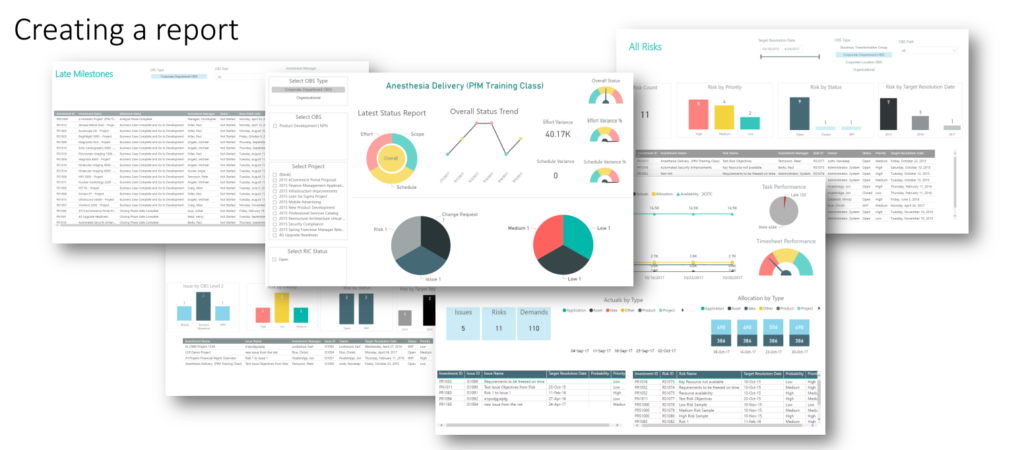
In essence, Power BI is your go-to platform for business intelligence. It allows you to create dashboards, which are essentially collections of data visualizations, metrics, and key performance indicators (KPIs). This guide aims to be your roadmap for navigating the intricacies of Power BI, from the rudiments of dashboard creation to advanced techniques for data analysis. So buckle up and get ready to elevate your data game!
What is Power BI?
Microsoft’s Power BI is a suite of business analytics tools that allow you to visualize your data and share insights across your organization. It’s a part of the broader Microsoft Power Platform, and it integrates seamlessly with other Microsoft Office products like Excel. The tool offers a desktop application for detailed data analysis and a cloud service for dashboard sharing.
Why Choose Power BI for Dashboards
When it comes to choosing a tool for creating dashboards, you’re spoiled for choice. However, Power BI offers some unique advantages. First off, its integration with Microsoft products ensures a shorter learning curve if you’re already familiar with the Office ecosystem. Secondly, it offers robust data modeling capabilities, making it suitable for intricate datasets. Lastly, Power BI provides a variety of sharing options, from publishing to the web to embedding in apps.
Getting Started with Power BI
Let’s cut to the chase and get you started on your Power BI journey.
Power BI for Dashboards
Setting Up Your Power BI Account
Before you do anything else, you’ll need to create a Power BI account. Simply head over to the Power BI website and follow the sign-up process. You’ll have the option to use a free account or a paid service, depending on your needs.
Installing Power BI Desktop
After you’ve created your account, the next step is to install the Power BI Desktop application. This application serves as the primary interface for creating detailed reports and dashboards.
Understanding the Power BI Interface
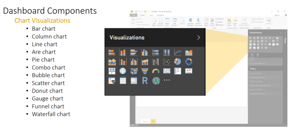
The first time you launch Power BI Desktop, the number of buttons, menus, and options can be a bit overwhelming. Take some time to familiarize yourself with the interface, focusing on the ‘Fields’, ‘Visualizations’, and ‘Pages’ tabs, as they are the most used areas.
Create Report Power BI for Dashboards
Data Sourcing and Preparation
Before you can create eye-catching visuals, you’ll need some data to work with.
Data Power BI for Dashboards
Data Importation Methods
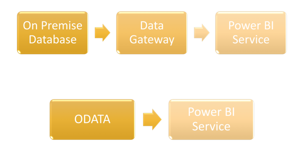
Power BI offers multiple avenues for data importation. You can import data from Excel files, SQL databases, and even from the web. The process usually involves a few clicks and some basic configuration.
Data Transformation with Power Query
Once you have your data in Power BI, you might need to clean it up. This is where Power Query comes in. This tool allows you to transform your data—think of it as a car wash for your datasets.
Data Modeling and Relationships
With your data cleaned and ready, it’s time to delve into the more technical aspects of Power BI.
Creating Relationships Between Tables
Why Relationships Matter
The efficacy of your Power BI dashboard hinges on how well your data models reflect real-world situations. Establishing relationships between tables ensures that queries yield accurate and meaningful results.
Types of Relationships
- One to One (1:1): One row in Table A relates to one row in Table B.
- One to Many (1:N): One row in Table A can relate to multiple rows in Table B.
- Many to Many (N:N): Multiple rows in Table A can relate to multiple rows in Table B.
How to Create Relationships
- Go to the “Model” view in Power BI Desktop.
- Drag the field from one table and drop it onto the matching field in the other table.
- Configure the relationship settings like cardinality and cross-filter direction.
Working with DAX Functions
Importance of DAX
DAX enables you to perform dynamic calculations on your data. Also, it’s integral for tasks like year-over-year growth calculations, averages, or complex aggregations.
Common DAX Functions
SUM(): Adds up values in a column.AVERAGE(): Calculates the mean.COUNT(): Counts rows that contain numbers.CALCULATE(): Alters the filter context of a calculation.
Creating a DAX Expression
- Navigate to “Data” or “Modeling” tab.
- Create a new column or measure.
- Enter your DAX formula.
Building Visual Elements
Selecting the Right Visuals
Choosing the appropriate visual representation can make or break the user’s understanding. Power BI offers visuals like bar charts, line graphs, pie charts, and advanced heat maps.
Customization and Theming
- Color Scheme: Alters the visual aesthetics to align with your brand.
- Font Style: Make texts readable and consistent.
- Layout: Organizes visuals in a way that the flow of information is logical.
Choosing the Right Visuals
Power BI offers a plethora of visual options, from basic bar charts to advanced heat maps. The key is to choose visuals that best represent the data you are trying to display.
Interactivity and Data Exploration
Adding Interactivity
- Slicers: Allow users to filter data.
- Buttons: Navigate to different reports or filter data.
- Drill-through: Let users click on a data point and see detailed information.
Data Exploration Tools
- Q&A: Allows for natural language queries.
- Insights Pane: Automatically identifies and visualizes trends in your data.
Customization and Theming
Once you’ve chosen your visuals, you can customize them to better align with your brand or the message you are trying to convey.
Interactivity and Data Exploration
Dashboards are not static; they are interactive tools that allow users to drill down into the data.
Adding Interactivity to Your Dashboard
Power BI provides various ways to make your dashboard interactive, including slicers, buttons, and drill-through features. These elements make it easier for the end-user to navigate your dashboard and find the information they are looking for.
Data Exploration Tools
Power BI is not just a tool for creating static reports; it’s a full-fledged data exploration platform. With features like Q&A and the Insights pane, you can go beyond the obvious and discover hidden trends in your data.
Publishing and Sharing Your Dashboard
What good is a dashboard if it sits on your computer, seen by nobody? Power BI offers various ways to share your hard work.
Uploading to Power BI Service
The Power BI Service is the online platform where you can publish your Power BI reports and dashboards. Once uploaded, you can share them with your team, schedule refreshes, and perform other maintenance tasks.
Sharing and Collaborating
Power BI makes it easy to share your dashboards and reports, whether it’s through direct sharing, creating a public web link, or embedding in an application.
Limit the Number of Visual Elements
The Issue
Each visual element on your dashboard consumes CPU and memory resources, both during data retrieval and rendering. When you have too many visual elements, the dashboard can become sluggish.
Strategies
- Prioritize Key Metrics: Only include the most critical metrics on the dashboard.
- Use Tabs Effectively: Categorize metrics and visualizations into different tabs to improve navigability and reduce load times.
Utilize Summarized Data
The Issue
Querying and processing detailed, row-level data can be resource-intensive, causing delays in dashboard load times.
Strategies
- Pre-Aggregate Data: Use SQL queries or other methods to aggregate data at the source level.
- Leverage DAX: Create summarized tables and measures in Power BI using DAX functions like
SUMMARIZE.
Optimize Query Performance
The Issue
Inefficient queries can be a significant bottleneck, especially when dealing with large datasets.
Strategies
- DirectQuery Mode: When dealing with real-time or large datasets, use DirectQuery to offload data processing to the source.
- Performance Analyzer: Use Power BI’s built-in Performance Analyzer to identify slow-performing queries and optimize them.
Be Mindful of Data Relationships
The Issue
Having complex relationships between tables can cause the Power BI engine to perform additional computational work, slowing down the dashboard.
Strategies
- Simplify Relationships: Avoid many-to-many relationships if possible. Also, use one-to-many or one-to-one relationships instead.
- Use Star or Snowflake Schema: These designs reduce relationship complexity, improving performance.
Use Built-in Performance Features
The Issue
Not utilizing Power BI’s built-in performance features can lead to performance issues.
Strategies
- Query Reduction: This feature delays the execution of a query until absolutely necessary, reducing the workload on the database.
- Row-level Security: Limit the data that is loaded into Power BI based on user credentials, improving performance.
Optimize Visual Interactions
The Issue
Interactions like slicers and drill-throughs can trigger additional queries and calculations, affecting performance.
Strategies
- Limit Drill-through: Use this feature judiciously and only on key metrics where detailed exploration is necessary.
- Optimize Slicers: Use single-select slicers or hierarchy slicers instead of multi-select slicers to minimize computational overhead.
Manage Data Refresh Times
The Issue
Frequent or poorly timed data refreshes can affect performance, particularly during high-traffic periods.
Strategies
- Off-peak Refresh: Schedule data refreshes during times when dashboard traffic is low to minimize impact.
- Incremental Refresh: Update only new or changed records instead of refreshing the entire dataset.
By implementing these strategies, you’ll create a dashboard that not only meets your data visualization needs but also performs efficiently, making for a more pleasant user experience.
FAQs
- What are the system requirements for Power BI Desktop? The latest system requirements can be found on the official Microsoft website. Generally, you’ll need Windows 7 or later and at least 4GB of RAM.
- Is Power BI suitable for large datasets? Absolutely, Power BI can handle large datasets with ease, especially if you’re using Power BI Premium.
- How secure is Power BI? Power BI offers robust security features, including role-based access and data encryption.
- What is the difference between Power BI Free and Power BI Pro? Power BI Free is suitable for individual use, while Power BI Pro offers additional collaboration features.
- Can I import data from sources other than Excel? Yes, Power BI supports a wide range of data sources, including SQL databases, cloud services, and web APIs.
- How do I keep my data updated in Power BI? You can schedule data refreshes at regular intervals, ranging from daily to monthly.
Conclusion
In the grand scheme of things, learning Power BI is like adding a Swiss Army knife to your data analytics toolkit. Whether you’re a seasoned data veteran or a complete beginner, Power BI offers a scalable and flexible platform for all your data visualization needs. So go ahead, take the plunge and start creating that killer dashboard today!
Hello, I’m Cansu, a professional dedicated to creating Excel tutorials, specifically catering to the needs of B2B professionals. With a passion for data analysis and a deep understanding of Microsoft Excel, I have built a reputation for providing comprehensive and user-friendly tutorials that empower businesses to harness the full potential of this powerful software.
I have always been fascinated by the intricate world of numbers and the ability of Excel to transform raw data into meaningful insights. Throughout my career, I have honed my data manipulation, visualization, and automation skills, enabling me to streamline complex processes and drive efficiency in various industries.
As a B2B specialist, I recognize the unique challenges that professionals face when managing and analyzing large volumes of data. With this understanding, I create tutorials tailored to businesses’ specific needs, offering practical solutions to enhance productivity, improve decision-making, and optimize workflows.
My tutorials cover various topics, including advanced formulas and functions, data modeling, pivot tables, macros, and data visualization techniques. I strive to explain complex concepts in a clear and accessible manner, ensuring that even those with limited Excel experience can grasp the concepts and apply them effectively in their work.
In addition to my tutorial work, I actively engage with the Excel community through workshops, webinars, and online forums. I believe in the power of knowledge sharing and collaborative learning, and I am committed to helping professionals unlock their full potential by mastering Excel.
With a strong track record of success and a growing community of satisfied learners, I continue to expand my repertoire of Excel tutorials, keeping up with the latest advancements and features in the software. I aim to empower businesses with the skills and tools they need to thrive in today’s data-driven world.
Suppose you are a B2B professional looking to enhance your Excel skills or a business seeking to improve data management practices. In that case, I invite you to join me on this journey of exploration and mastery. Let’s unlock the true potential of Excel together!
https://www.linkedin.com/in/cansuaydinim/

