What is Pareto Chart (Pareto Analysis) in Quality Management?
There are many tools, techniques, diagrams, and charts are used in quality management to make analysis and improve the process quality. Pareto Chart (also known as Pareto Analysis or Pareto Diagram) is one of the seven basic tools of quality which helps to determine the most frequent defects, complaints, or any other factor. It is a visual tool widely used by professionals to analyze data sets related to a specific problem or an issue. From this aspect, it can be used as an efficient tool for problem-solving. In this article, we will demonstrate how to make and read a Pareto chart by using a Pareto chart example.
Table of Contents
7 Basic Tools of Quality
The seven basic tools of quality involve a group of visual and graphical techniques that can be used to solve problems or issues related to quality. Many people with having limited knowledge about statistics can easily use these tools because of their simplicity.
Below are the even basic tools of quality;
- Fishbone Diagram (Cause and Effect or Ishikawa Diagram)
- Check sheet
- Control chart
- Histogram
- Pareto chart
- Scatter diagram
- Stratification (also known as a run chart or flow chart)
An Italian economist Vilfredo Pareto developed this quality tool, hence it was named Pareto Chart after him.
Typically, Pareto Chart involves vertical bars descending from left to right and a line that represents a cumulative curve. The bar that has the highest value falls into the left and the bar that has the lowest value falls into the right. The vertical axis on the left side represents the frequency of occurrence, costs or another measurement related to the survey. The vertical axis on the right side represents the cumulative percentages of the values shown in the left vertical axis.
How to Make and Read a Pareto Chart ?
Pareto Charts are used to analyze a data set to understand the frequency of occurrence of a problem. Sometimes there may be more than one cause for the problem and you use this tool to determine the most important one.
Below are the steps for creating a Pareto Charts.
- Decide the categories to be represented on the chart
- Decide the type of measurement for the vertical axis on the left. Measurements may be cost, income, defects, quantity, etc.
- Specify the time period for the chart (one day, one hour, one production period, etc.)
- Collect data for each category or use the existing data
- Specify the scale for measurements and organize the vertical axis on the left by using this scale.
- Draw the vertical bars for each category and place the highest value on the left and the lowest value on the right.
- Draw the cumulative curve by calculating the percentages.
The most important class or category is represented by the biggest bar which is on the left. The least important category is symbolized by the smallest bar which is on the right. In other words, the bars on the left are more important than the bars on the right.
There is a cumulative percentage line in The Pareto Chart which helps to analyze the effect of each category. The slope of the cumulative percentage line changes based on the importance of each category.
If a Pareto effect exists, the cumulative line rises steeply for the first few defect types and then levels off. If the bars are almost linear, it is easy to analyze the slope of the cumulative percentage line.
Pareto Chart Example
Let’ s assume that you are a quality control manager of a concrete plant and you tested the strength of all the concrete samples. Concrete strength must be 30 Mpa and you categorized the results as per below table.
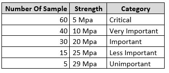
Pareto Chart Example
In order to draw the cumulative percentage line, you calculated the cumulative values as shown in the table below.

Pareto Chart Example-Cummulative Values
By using the categories (strength) and the number of samples tested you can draw the Pareto chart as shown in the figure below.
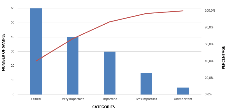
Pareto Chart
Benefits & Limitations of Pareto Chart (Pareto Analysis)
Key Benefits
Below are some of the benefits of Pareto Analysis
- It is an effective tool for communication with stakeholders visually
- It enhances organizational efficiency
- It helps to determine the most significant causes of a problem
- It enhances problem-solving skills
- It is a visual presentation tool
- It can be created easily with limited statistical knowledge
- It improves decision making within the organization
Limitations
Below are some of the limitations of Pareto Analysis
- The Pareto analysis relies on past records. If the past records are not correctly stored, the result of Pareto analysis may be deceptive.
- The Pareto analysis does not define the root cause of a problem. It demonstrates the frequency of occurrence. An additional tool like a fishbone diagram must be used to define the root cause.
- Sometimes one Pareto Analysis cannot be enough. For multiple causes and problems, multiple Pareto charts may be required.
Summary
It is not easy to define the causes of problems all the time. Project teams and quality managers spend many hours to detect the causes and decide methods to solve them. Pareto Analysis is a valuable technique for making decisions in quality management that helps to analyze the defects and their causes. It is easy to use it for various purposes such as visualizing the importance of various categories, prioritizing the customer needs, analyzing the opportunities for investment, etc.
In this article, we demonstrated how to read a Pareto chart by using an example and analyzed the benefits and limitations of it. We hope that it will be useful for quality improvement practices.

Since 2004 I work for ICT Management which provides worldwide quality management service. Passionate about new technologies, i have the privilege to implement many new systems and applications for different departements of my company. I have Six Sigma Green Belt.




Pareto did not come up with the Pareto chart. Joseph Juran came up with it and named it after Pareto. Pareto made a comment about 80 % of land in Italy is owned by 20% of the people. But Juran turned it into the vital few and the useful man…and then came up with a pareto chart, named after pareto, but developed by juran. Research is golden and assumptions are oft flawed as is this paper.
Can you tell uѕ more about this? I’d lіke to find out some additional information.