Scatter Diagram (Scatter Plot, Scatter Graph) Explained
What is a Scatter Diagram? – A Scatter Diagram, which graphs pairs of numerical data, is a member of the “old seven” (seven basic tools of quality). It is a kind of mathematical graph for process improvement, which is used to show the values of commonly two variables for numerical data sets. The horizontal axis and vertical axis are used to determine the position of each variable. Finally, the points will form a line shape if the variables are correlated. Some PMP (Project Management Professional) aspirants find it difficult to understand because other charts use lines or bars to demonstrate data sets, while a scatter diagram uses only points to show correlation. However, the scatter plot is very easy to understand like the other charts and graphs if you know how to interpret the results. In this article, we will answer: What are the Scatter diagrams used for? and How to Draw a Scatter Diagram? with a Scatter Diagram Example.
Table of Contents
What is a Scatter Diagram?
There are seven basic quality management tools for planning, monitoring, and controlling processes to improve quality-related issues within the organization.
- Fishbone diagram
- Check sheet
- Control chart
- Histogram
- Pareto chart
- Scatter diagram
- Stratification
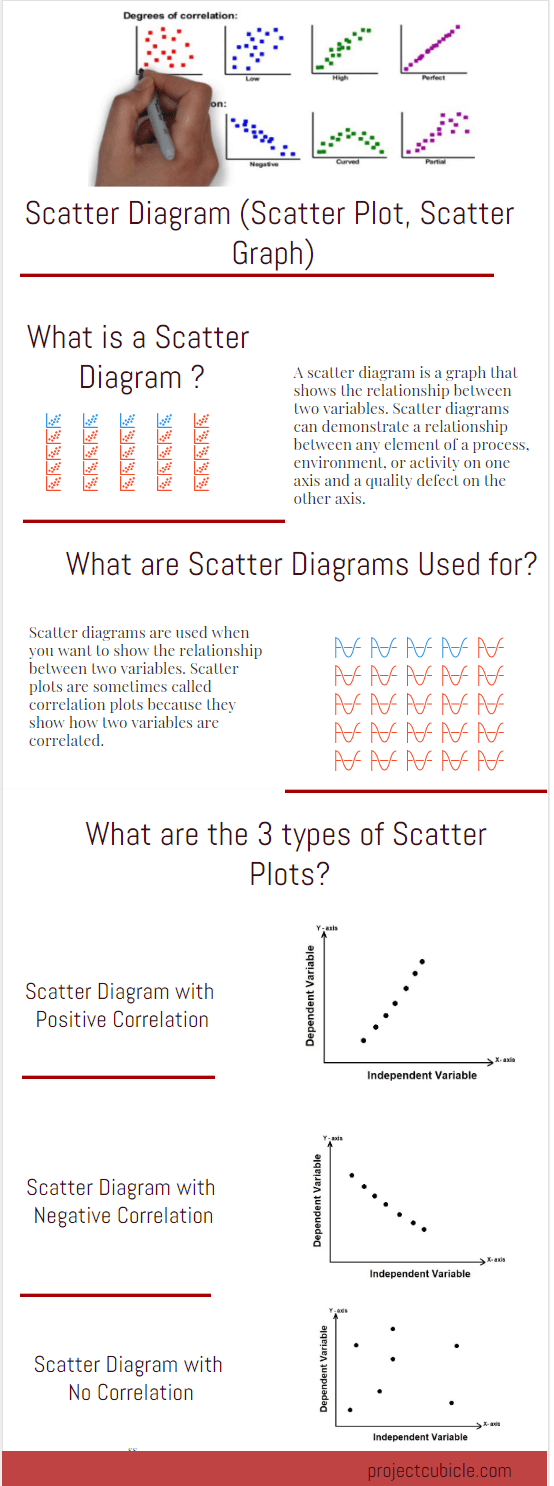
A scatter graph is a type of diagram which demonstrates the relationship between two variables for a group of numerical data. It is used for process improvement to illustrate the relationship between a component of a process on one axis and the quality defect on the other axis.
How to Draw a Scatter Diagram Step by Step?
You can draw a scatter diagram with two variables, usually, the first variable is under the control of the researcher and the second variable depends on the first one. The independent variables which affect the dependent ones are typically plotted along the horizontal axis (X-axis) and the dependent variables are plotted along the vertical axis (Y-axis).
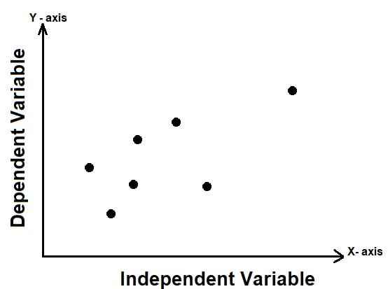
Independent & Dependent Variables
The independent variable affects the dependent variable, therefore, the independent variable is also known as the control parameter.
Sometimes both variables may be independent. In that case, the scatter graph demonstrates the level of correlation between them. In other words, it helps to determine how closely the variables are related.
STEP 1: Determine the issue, collect and categorize the data to be analyzed.
STEP 2: Draw the vertical and horizontal axis and plot each variable on the graph.
STEP 3: Determine the type of correlation (positive, negative, strong, weak, etc.)
STEP 4: Determine the root cause of the problem by interpreting results.
What are the Scatter Diagrams Used For?
Scatter Diagram Example
Let’s review the following scatter diagram example to understand the topic better.
An HSE manager collects data for the two variables below in order to understand the relationship between the number of accidents and long working hours within a construction project.
- Number of Accidents
- Working Hours
The HSE manager plots the data in a scatter plot by assigning the “working hours” to the horizontal axis (X-axis) and the “number of accidents” to the vertical axis (Y-axis).
The scatter graph of all the data in the research helps the HSE manager to understand the relationship between the two variables. He notices that as the working hours increases, the number of accidents also increase. “Working hours” is the independent data and the number of accidents depends on the working hours.
The below table shows the working hours and accidents within a project.
|
Working Hours vs Accidents |
|
| Working Hours | Accidents |
| 11000 | 11 |
| 12000 | 17 |
| 13000 | 24 |
| 14000 | 31 |
| 15000 | 40 |
| 16000 | 47 |
| 17000 | 57 |
| 18000 | 66 |
| 19000 | 80 |
The below chart illustrates the same data as a Scatter Plot.
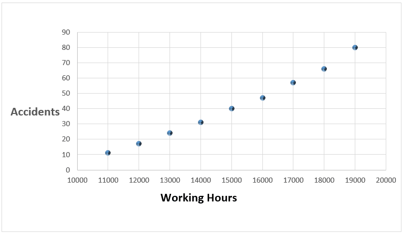
Scatter Diagram Example
Correlation
Correlation is used to define the relationships between the variables. In other words, correlation shows how the variables relate to each other. Scatter diagrams can be categorized according to the slope of the data points. Three types of correlation: positive, negative, and none (no correlation) may be shown in the diagrams based on the data set and variables.
Scatter Diagram with No Correlation
If there is no possible relationship between the variables, the correlation type is be called “no correlation”. Also, it can be named as zero correlation type. The two variables are not linked. In that case, you cannot draw any line through them. For example, air temperature and shoe size have no correlation; as the air temperature increases, shoe size is not affected.
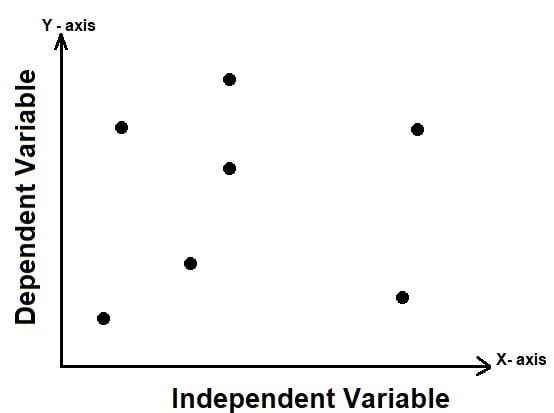
No Correlation
Scatter Diagram with Negative Correlation
In this type of correlation one variable increases as the other variable decreases. For example, if the speed increases, travel time to a destination decrease.
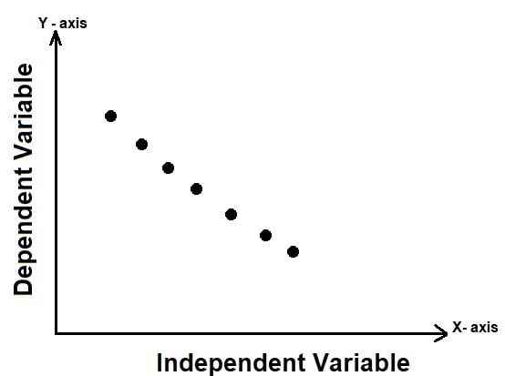
Negative Correlation
Scatter Diagram with Positive Correlation
If there is a positive correlation between the variables, this means that if one variable increases the other one increases, and if one of them decreases the other one decreases. For example as the speed of a turbine increases, the amount of electricity that is generated increases.
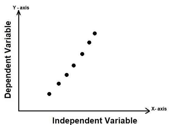
Positive Correlation
Strong and Weak Correlation
If the variables are a bit closer to each other, this means that there is a weak correlation between them. It can also be called “Scatter Diagram with Low Degree of Correlation”. If the variables are closer to each other, this means that there is a strong (high degree of) correlation between the variables.
Conclusion
Scatter diagrams are used to understand the relationships between variables. They are very easy to create and use. If the data don’t cover a wide enough range, the relationship between the variables is not apparent. In some cases, both of the two variables may be affected by a third variable. Some PMP aspirants confuse the fishbone (Ishikawa ) diagram with the scatter plot. The fishbone diagram enables to define the root cause of a problem where the scatter plot helps to look for a relationship between variables. If you want to share your experiences regarding how to draw a Scatter Diagram, you can use the comments section.
External References
[1]: ASQ: The Global Voice of Quality
See Also

Since 2004 I work for ICT Management which provides worldwide quality management service. Passionate about new technologies, i have the privilege to implement many new systems and applications for different departements of my company. I have Six Sigma Green Belt.

