Analyzing Data Dynamics: Control Chart versus Run Chart
If you are preparing for the PMP Certification exam, most probably you asked the following questions yourself- What is the purpose of a control chart? or What are the types of control charts? Basically, Control Chart and Run Chart are two essential Quality Control tools. Both of them are used for evaluating and analyzing quality results within a project or a process. When you look at these charts, you will have an insight into the health of the process. However, a lot of people mix up these two different tools for quality control and mistakenly think that they are interchangeable. This article will try to explain the similarities and differences between them.
Table of Contents
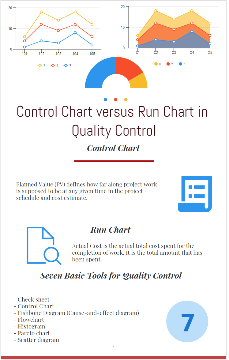
There are seven tools for Quality Control which are below;
- Check sheet
- Control Chart
- Fishbone Diagram (Cause-and-effect diagram)
- Flowchart
- Histogram
- Pareto chart
- Scatter diagram
They are also known as “The Old Seven” or “The Basic Seven.”
As you see from the above list, a Control Chart is included in the seven tools for Quality Control. Although, a run chart is not included in the list, understanding its features will help you to understand the control chart better.
In brief, both control charts and run charts are useful tools that can help you determine trends or defects in the product. They are communication tools that help you to understand how the performance of the process is.
What is a Run Chart?
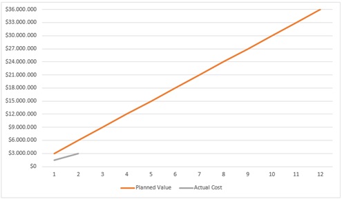
A run chart is a simple chart that shows data points over a period of time. The displayed data in a run chart mostly show trends, the performance of manufacturing, etc. Typically it is a two dimensional graph in which one axis shows time and the other axis shows the value.
A run chart helps you analyze the following over time:
- Changes or trends of the process
- The cycle of the process
- Performance of a process
For the project performance measurement, you can draw planned and actual progress lines with the help of run charts. After creating the project schedule, you can extract the planned figures and draw the planned progress curve. As the project progresses, you can insert the actual figures and draw the actual progress curve. This is an example for the usage of Run Charts.
What are the Benefits of Using a Run Chart?
The following are a few benefits of a Run Chart:
- It is a visual tool that is easy to draw and use.
- It enables to determine the performance of a process easily
- It does not require too many technical skills.
- It is a communication tool that enables to make decision making.
Limitations of a Run Chart
Below are the limitations;
- A run chart is not related to statistical control limits. Therefore, you can not see the major and minor tolerance limits.
- It does not provide you enough information regarding the stability and trends of the process.
What is a Control Chart?
A control chart is a specific type of graph that shows data points between upper and lower limits over a period of time. It is also known as a Shewhart chart which is developed by Mr. Walter A. Shewhart. You can use a control to understand if the process is under control or not.
These charts commonly have three types of lines such as upper and lower specification limits, upper and lower limits and planned value. By the help of these lines, Control Charts show the process behavior over time.
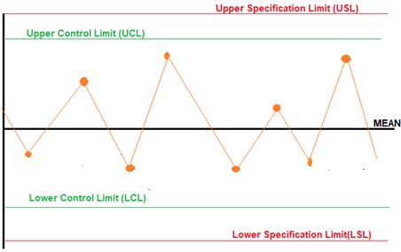
A Control chart helps you to understand if the process is under control or not. If the results are beyond the control limits you can say that there is an error in the product or process.
Note that Control Charts provide more specific information and understanding of the process rather than the Run Charts.
For example, a control chart can be used to understand the behaviour of a chemical agent. Let’s say the chemical agent must stay effective in the system for a minimum of 30 minutes but last no more than 60 minutes, to prevent its harmful effects. In that example, the lower control limit is 30 minutes and the upper control limit is 60 minutes.
Benefits of Using a Control Chart
The following are a few benefits of this chart:
- It enables to specify the stability of a process.
- It enables to specify the regions where the quality needs to be improved or where the corrective actions need to be taken.
- It enables to analyze the variations between the given limits
- It provides a general view of your process on a single chart.
Limitations of Control Charts
Below are the limitations;
- If the upper and lower threshold limits are determined incorrectly, the results will cause wrong decisions.
- It requires a piece of basic knowledge of statistical terms and concepts in order to interpret the curves.
Summary
Both Control Charts and Run Charts are generated by placing the data within a given period. You can obtain a lot of information when you look at them. However, Control Charts include upper and lower control limit lines. Depending on the targets of the project, the most suitable chart type could be selected. Generally, they give more specific information and understanding of the process, compared to the Run Charts.
Note that these charts are essential communication tools for the project teams. Project teams use them to discuss important performance issues with key project stakeholders.
This is where this blog post ends. If you want to add or share anything, you can use the comments section below to do so.
See Also
External Reference

Since 2004 I work for ICT Management which provides worldwide quality management service. Passionate about new technologies, i have the privilege to implement many new systems and applications for different departements of my company. I have Six Sigma Green Belt.

