Stacked Bar Chart and Primavera P6 Stacked Histogram
Charts and histograms are visual presentation tools that help readers to understand, analyze and demonstrate the percentages and/or quantities of particular results. Pie charts, line graphs, stacked histograms, bar charts are used to visualize the key parts of large data sets. A stacked bar chart is a type of bar chart used to make a comparison between individual data points. This Primavera P6 Tutorial demonstrates how to create a Stacked Bar Chart and Stacked Histogram in Primavera P6.
Table of Contents
What is a Stacked Bar Chart?
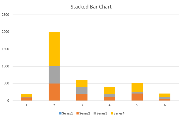
A stacked bar chart, also known as a stacked bar graph is a visual presentation tool. It is used to break down the whole data set into smaller parts to compare them. In a typical stacked bar chart, columns and segments represent the data sets. One bar represents a total amount and the segments of the bar represent smaller and different parts of that amount.
Above figure shows a typical stacked bar chart. There are six columns and each column is divided into four series. In other words, each column displays a total amount and series are the sub amounts. Series are the equivalent segments with the same color in each column. Using different colors for each segment makes it easier to make a comparison between bars.
A stacked bar chart enables to track the changes in a data set easily. Assume that you are reporting the labor costs of a construction project. You are asked to show various types of labor costs in one chart over time. The best thing to do is to create a stacked bar chart and show the cost changes.
How to Analyze a Stacked Bar Chart?
Series (equivalent segments) are comparable in a typical stacked bar chart and they have the same color. The x-axis (category axis) on the bottom side represents the segments and the y-axis (numerical axis) on the top represents the stacked variable. Category axis describes the types of categories being compared, and the numerical axes represent the values of the data. The x and the y-axis can be switched in some versions based on your presentation.
Primavera P6 Stacked Histogram
Primavera P6 Stacked Histogram is a visual presentation tool. Same type but different resources can be demonstrated in the same histogram. For example unskilled labor, skilled labor, foreman, craftsman, carpenter, etc. resources can be shown in one histogram with different colors. This tool provides very useful resource information for the whole project or an activity. Primavera P6 Stacked Histogram allows to view and analyze resource trends.
How to Create a Stacked Histogram (Stacked Bar Chart) in Oracle Primavera P6?
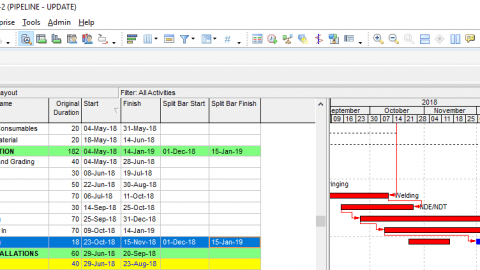
In order to create a stacked histogram in Oracle Primavera P6, you need a resource loaded schedule. The figure below (Figure 1) shows a sample pipeline project schedule.
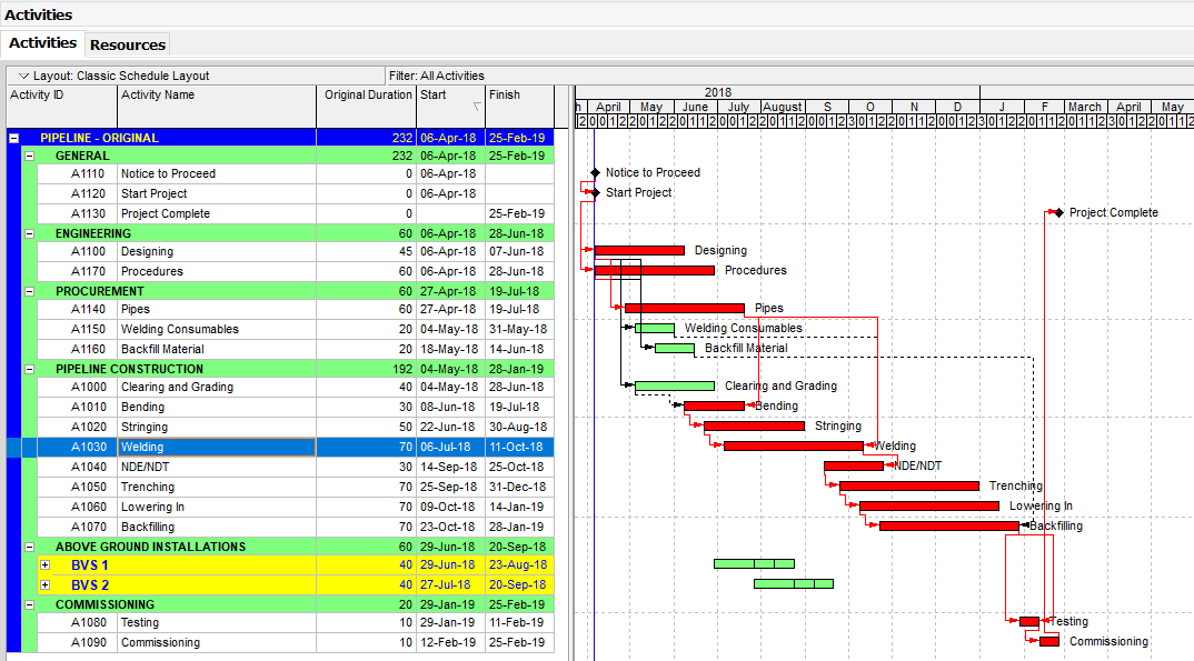
Figure 1 Sample Project
Four types of resources (Skilled Labor, Unskilled Labor, Foreman, and Craftsman) are assigned to the construction activities as shown in Figure 2.
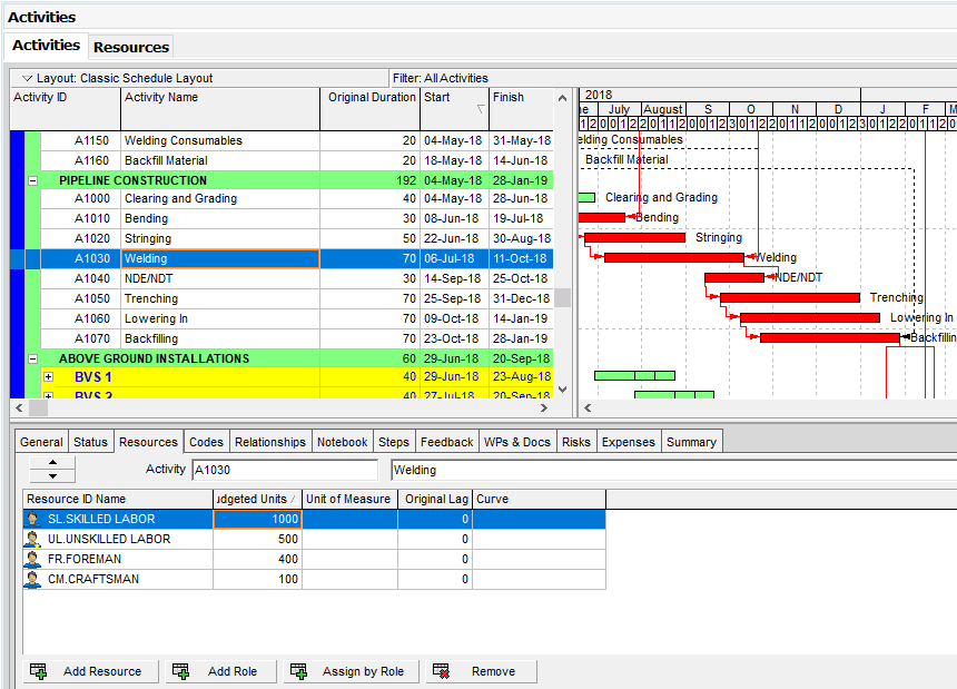
Figure 2 Assigning Resources
Resources of each activity can be seen from the Resources tab. In order to open the Resources tab, Select View | Show on Bottom | Resources from the main drop-down menu at the top of the screen.
In order to see the current project’s resources, use the filter shown in the figure below, Figure 3.
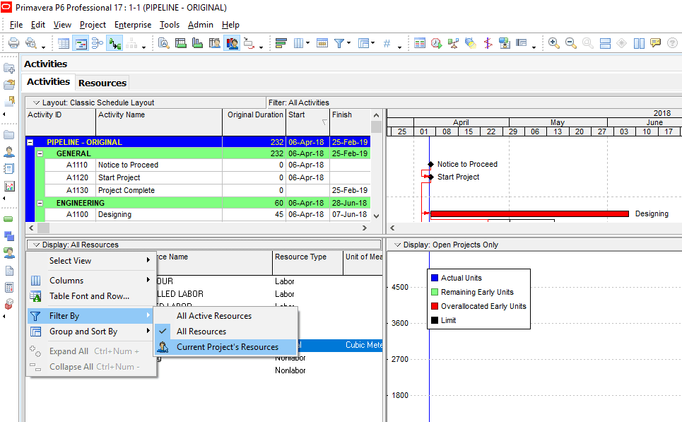
Figure 3 Filter By Current Project’s Resources
Click Stacked Histogram from the Display menu as shown in the figure below, Figure 4.
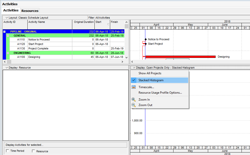
Figure 4 Display Stacked Histogram
This will open the stacked histogram field.
Right-click in the blank stacked histogram field and select the Resource Usage Profile Options menu item as shown in Figure 5.
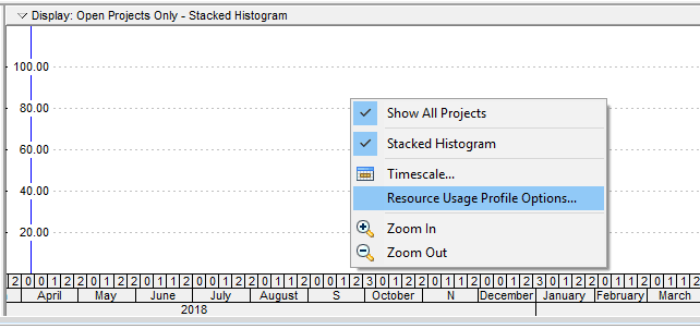
Figure 5 Resource Usage Profile Options – (Primavera P6 Stacked Bar Chart & Stacked Histogram)
This will bring the Resource Usage Profile Options window. Then click on the Add button at the bottom as shown in Figure 6.
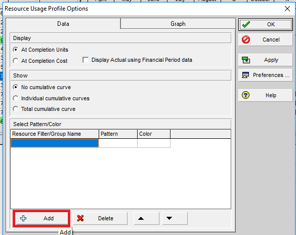
Figure 6 Resource Usage Profile Options Add
In the new opened Filters Window, type the filter name as “Unskilled Labor” and define the parameters as shown in the figure below, Figure 7.
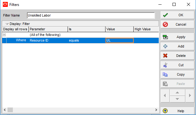
Figure 7 Filtering Parameters
In the Filters window, filtering parameter is defined by using the Resource ID. Then, click the “Ok” button and do the same for the other three labor resources.
Then, select color and pattern for each of the resources in the Resource Profile Options window as shown in Figure 8.
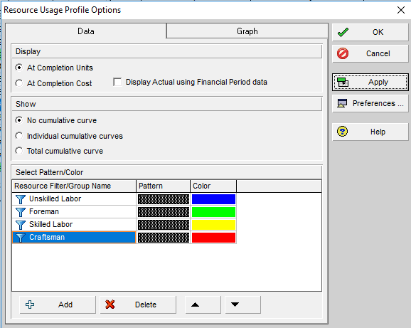
Figure 8 Select Color and Pattern
P6 Stacked Histogram
Then, click Apply and see the stacked histogram as shown in Figure 9.
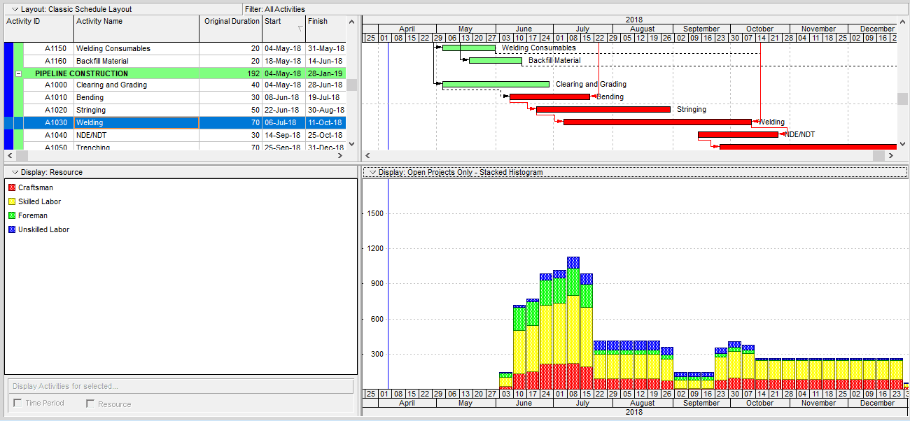
Figure 9 Stacked Histogram (Stacked Bar Chart)
As it is seen from the figure above, stacked histogram provides useful resource information in an attractive way. Each histogram shows the weekly total resource usage and the colors represents the breakdown of each resource histogram.
A cumulative curve (S-curve) can be added to the stacked histogram by the help of Show section of Resource Usage Profile Options window. In our sample, we click on ” No cumulative curve” option. The arrow buttons shown at the bottom of the Resource Usage Profile Options window can be used to adjust the order of the filters.
Primavera P6 Tutorial for Beginners
Summary
Visual presentation methods play significant roles in our everyday life. Pie charts, line graphs, bar charts, stacked histograms allow us to demonstrate large data sets easily and effectively. Primavera P6 Stacked Histogram tool is an efficient tool for demonstrating the same type but different resources in the same histogram. If you try to show different types of resources like material, labor, non – labor in the same histogram, the graph will be blank.
See Also
Three Week Look Ahead Schedule

Irma Gilda is chief executive of Sonic Training and Consultancy Co., the training platform offers project planning and scheduling More than 60 k learners have used the platform to attain professional success. Irma is a professional Primavera P6 Trainer.



Great resource.