Unleashing the Power of Heat Maps in Power BI: What is it, How to use it?
In the vast universe of data visualization, heat maps stand out as one of the most intuitive and visually appealing tools. When combined with Power BI, a leading business analytics tool, heat maps can reveal hidden patterns and insights in your data. Let’s delve deeper into the world of Heat Map in Power BI to grasp its capabilities and how to harness them effectively.
Table of Contents
The digital age has ushered in a plethora of ways to visualize data, yet few are as impactful as the Heat Map in Power BI. Marrying intuitive design with intricate data patterns, heat maps provide a dynamic representation of information. For those aiming to optimize their Power BI utilization, understanding the nuances of the heat map feature is a game-changer.

Heat Maps
What is a Heat Map?
At its core, a heat map uses color to represent data values in a two-dimensional space. Instead of plotting numbers, you’re essentially plotting colors. The variations in color intensity—ranging from cool to warm—indicate the density or value of the data point.
At the intersection of design and data, heat maps offer an insightful interpretation of complex datasets. They translate numeric values into a spectrum of colors, making it easier to discern patterns, trends, and outliers. When integrated with Power BI, one of the leading business analytics tools, these visualizations take on an even more powerful dimension.
Why Heat Maps are Essential in Power BI:
- Enhanced Pattern Recognition: Navigating rows of numbers can be tedious. With Power BI’s heat map, anomalies, spikes, and troughs become instantly recognizable. For businesses, this can be the difference between capitalizing on an opportunity and missing it.
- Data Density at a Glance: For sectors inundated with bulk data, recognizing data density areas can be paramount. Heat maps shine in this domain, turning volumes of numbers into intuitive color gradients.
- Versatility across Verticals: Whether it’s retail, healthcare, finance, or any other industry, the adaptability of the Heat Map in Power BI ensures its relevance, making it a favorite among data analysts globally.
Creating a Heat Map in Power BI:
- Data Preparation: Before diving into visualization, ensure your data is clean and structured. For instance, if you’re plotting a geographical heat map, ensure locations are consistently labeled and free of errors.
- Choosing the Right Visualization: Power BI offers various types of heat maps, from simple grid-based ones to geographical heat maps. Pick one that aligns with your data type and the insights you aim to derive.
- Customization: Adjust color gradients to ensure that data variations are clearly visible. For instance, if you’re analyzing sales data, you might choose a gradient that ranges from green (low sales) to red (high sales). The customization ensures the heat map aligns with the viewer’s intuitive understanding.
- Interactivity: Power BI’s heat maps are not just static visuals. They are interactive, enabling users to hover over data points to view exact values or click to drill down for more detailed insights.
Optimizing Heat Maps for Maximum Insight:
- Balanced Color Palette: Using a balanced color gradient is crucial. Too many colors can be overwhelming, while too few might miss subtle data variations.
- Interactive Features: Power BI allows users to integrate interactivity into their heat maps. Features like hover-over details or drill-down capabilities can significantly enhance user experience.
- Consider Your Audience: Customize your heat map based on the intended audience. A technical audience might appreciate more detail, while a general one would prefer simplicity.
Advanced Tips for Heat Maps in Power BI:
- Legend Utilization: Always include a clear legend that defines what each color intensity denotes. This aids viewers in interpreting the heat map accurately.
- Optimal Color Selection: Ensure that the color palette chosen is clear to all viewers, including those with color vision deficiencies.
- Data Overload: Avoid overcrowding your heat map with excessive data points. If the map is too cluttered, it might defeat its purpose, making it harder to discern patterns.
- Combine with Other Visuals: Sometimes, using a heat map alongside other visualizations, like bar graphs or scatter plots, can provide more comprehensive insights.
Example: Retail Business Analysis using Heat Maps in Power BI
Background: XYZ Retailers have stores spread across the country. With an expansive dataset that includes monthly sales figures for each store, they aim to identify which locations are performing the best and which ones need attention.
Steps:
- Data Collection: XYZ gathers data for all its stores, including:
- Location of the store (City, State)
- Monthly Sales figures
- Monthly foot traffic
- Importing Data into Power BI: The data, stored in an Excel spreadsheet, is imported into Power BI.
- Data Cleaning: XYZ ensures there are no missing values, and all store locations are labeled uniformly.
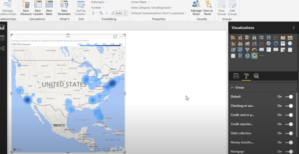
- Creating a Heat Map: Using the geographical heat map visualization in Power BI, XYZ plots the sales figures for each store. The map of the country now displays varying shades:
- Darker shades (e.g., deep blue) represent higher sales.
- Lighter shades (e.g., light blue) represent lower sales.
- Interpreting the Heat Map: Upon observation:
- Stores in coastal regions have darker shades, indicating higher sales.
- Some stores in the interior have lighter shades, signifying below-average sales.
- Drilling Down: XYZ decides to explore further. They integrate the monthly foot traffic data into another heat map. Interestingly, the foot traffic pattern doesn’t align completely with sales, meaning some stores with high foot traffic have lower sales.
Insights and Actions:
- Coastal Popularity: The coastal stores might be benefiting from tourist traffic or higher population densities, leading to higher sales. XYZ considers replicating the successful strategies from these stores in other locations.
- Conversion Concerns: Stores with high foot traffic but lower sales indicate a conversion issue. Perhaps the store layout isn’t optimal, or the staff requires better training. XYZ decides to investigate these stores further, considering a redesign or additional staff training sessions.
- Promotions: For stores with low foot traffic and low sales, XYZ considers localized marketing campaigns or promotions to boost both foot traffic and sales.
This example showcases how a retail business can utilize Heat Maps in Power BI to visually understand their sales distribution across regions, draw meaningful insights, and then take data-driven actions.
Heat maps in Power BI offer a unique blend of visual appeal and analytical power. They transform numbers into intuitive visuals, making data digestion easier and more effective. Whether you’re a business analyst, marketer, or data enthusiast, understanding and utilizing heat maps in Power BI can elevate your data storytelling skills to new heights.
Hello, I’m Cansu, a professional dedicated to creating Excel tutorials, specifically catering to the needs of B2B professionals. With a passion for data analysis and a deep understanding of Microsoft Excel, I have built a reputation for providing comprehensive and user-friendly tutorials that empower businesses to harness the full potential of this powerful software.
I have always been fascinated by the intricate world of numbers and the ability of Excel to transform raw data into meaningful insights. Throughout my career, I have honed my data manipulation, visualization, and automation skills, enabling me to streamline complex processes and drive efficiency in various industries.
As a B2B specialist, I recognize the unique challenges that professionals face when managing and analyzing large volumes of data. With this understanding, I create tutorials tailored to businesses’ specific needs, offering practical solutions to enhance productivity, improve decision-making, and optimize workflows.
My tutorials cover various topics, including advanced formulas and functions, data modeling, pivot tables, macros, and data visualization techniques. I strive to explain complex concepts in a clear and accessible manner, ensuring that even those with limited Excel experience can grasp the concepts and apply them effectively in their work.
In addition to my tutorial work, I actively engage with the Excel community through workshops, webinars, and online forums. I believe in the power of knowledge sharing and collaborative learning, and I am committed to helping professionals unlock their full potential by mastering Excel.
With a strong track record of success and a growing community of satisfied learners, I continue to expand my repertoire of Excel tutorials, keeping up with the latest advancements and features in the software. I aim to empower businesses with the skills and tools they need to thrive in today’s data-driven world.
Suppose you are a B2B professional looking to enhance your Excel skills or a business seeking to improve data management practices. In that case, I invite you to join me on this journey of exploration and mastery. Let’s unlock the true potential of Excel together!
https://www.linkedin.com/in/cansuaydinim/


