Mastering Data Visualization: Creating Clustered Column Chart in Excel
How to Make a Clustered Column Chart in Excel? How to insert a clustered column chart in Excel? Welcome to ProjectCubicle, your go-to resource for in-depth Excel tutorials. In this tutorial, we’ll delve deep into the world of data visualization by teaching you how to create clustered column charts in Microsoft Excel. Whether you’re a seasoned Excel pro or just starting, this guide will equip you with the knowledge and skills to craft compelling clustered column charts for your data presentations.
Table of Contents
Understanding Clustered Column Charts
How to Make a Clustered Column Chart in Excel? Clustered column charts, sometimes referred to as clustered bar charts, are a versatile tool for presenting and comparing data in Excel. They are particularly effective when you need to showcase data that has multiple categories and subcategories. Here’s why they matter:
- Visual Comparison: Clustered column charts allow you to compare data points side by side, making it easier to identify trends, differences, and relationships within your dataset.
- Data Categories: The vertical columns represent categories, while the height of each column corresponds to the values associated with those categories. This format makes it easy to see how data varies across different groups.
- Ideal for Categorical Data: They are especially useful for categorical data, such as sales data by product categories, survey results by age groups, or market share by regions.
The COMBIN Function in Excel: Do You Want to Guess the Lottery? – projectcubicle
Preparing Your Data
Before you can create a clustered column chart, you need to ensure your data is structured appropriately. The organization of your data plays a crucial role in the effectiveness of your chart.
- Data Structure: Ensure your data is logically organized, typically with one column for categories (e.g., product names, months, regions) and another for corresponding values (e.g., sales figures, quantities, percentages).
- For example, imagine you’re creating a clustered column chart to visualize monthly sales data for different product categories. Your spreadsheet might look like this:
| Month | Product A | Product B | Product C |
|———–|—————|—————|—————|
| January | 100 | 120 | 90 |
| February | 110 | 130 | 95 |
| March | 105 | 125 | 92 |
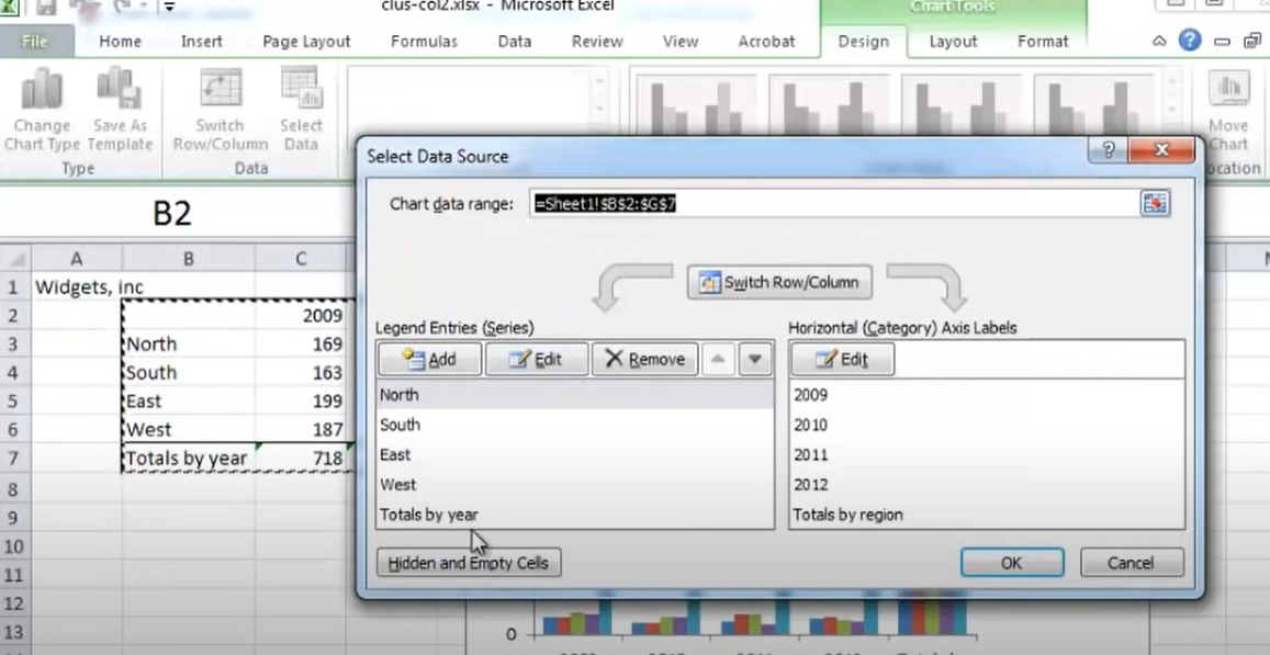
- Select Data: Highlight the data range you want to include in your chart. In the example above, you would select the entire data table (excluding column headers).
- To select the data, click on the cell containing the first data point (e.g., “January” in the above example), hold down the left mouse button, and drag to the last data point in the table.
The COMBIN Function in Excel: Do You Want to Guess the Lottery? – projectcubicle
Creating the Clustered Column Chart
Now that your data is organized, it’s time to create your clustered column chart. Follow these steps:
- Insert Chart: Navigate to the “Insert” tab in Excel’s ribbon.
- In Excel 2013 and later versions, you’ll find the “Insert” tab. Click on it to access the chart options.
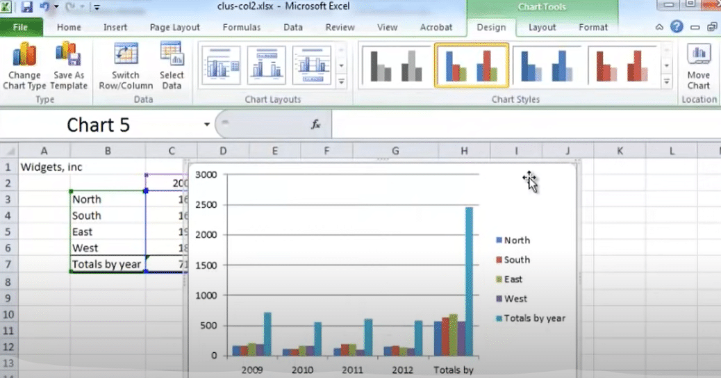
- Select Chart Type: Click on “Column Chart” and then choose “Clustered Column”.
- Excel will insert a default clustered column chart onto your worksheet.
- Customizing Your Chart: To make your chart more informative and visually appealing, customize it further:
- Chart Title: Add a descriptive title to your chart. Click on the chart title area and enter the title text.
- Example: “Monthly Sales by Product Category.”
- Axis Labels: Ensure that your chart has appropriate axis labels for the x-axis (usually the categories) and y-axis (values). These labels provide context to your audience.
- Data Labels: Consider adding data labels to the columns to display the exact values. Data labels can be helpful when you want to emphasize specific data points.
- Legend: If your chart has multiple data series (e.g., sales for different years), make sure you include a legend to distinguish between them.
- Chart Title: Add a descriptive title to your chart. Click on the chart title area and enter the title text.
- Fine-Tuning: Excel offers various chart formatting options:
- Gridlines: You can choose to display or hide gridlines, which are horizontal and vertical lines that help readers gauge values more accurately.
- Colors and Styles: Experiment with different color schemes and chart styles to match your chart’s aesthetics with your document or presentation.
- Chart Elements: Click on the chart, and you’ll notice a “+ Chart Elements” button on its upper-right corner. This button allows you to add or remove specific chart elements like data labels, trendlines, or error bars.
Formatting and Styling
Creating a visually appealing clustered column chart involves making design choices that enhance the chart’s readability and impact:
- Color Palette: Choose colors thoughtfully. Effective color schemes can make your chart more engaging and help your audience differentiate between categories or data series.
- For instance, if you’re presenting sales data for various product categories, you might use distinct colors for each category. This makes it easier for viewers to identify and compare the products.
- Data Labels: Data labels can provide additional context to your chart. To add data labels to your columns, right-click on a data series, select “Add Data Labels,” and Excel will display the values on top of each column.
- For instance, in a clustered column chart displaying monthly sales, data labels would show the exact sales values for each category in each month.
Now, let’s address some common questions and provide additional tips to enhance your clustered column chart expertise:
People Also Ask (FAQs):
Can I change the chart type later if needed?
Absolutely! Excel allows you to change the chart type easily. Select your chart, click on “Chart Elements,” and choose “Change Chart Type.”
Example: If you initially create a clustered column chart but later decide to switch to a stacked column chart, Excel provides the flexibility to make that change.
How do I add error bars to my clustered column chart?
Error bars can be valuable for displaying uncertainty or variation in your data. To include error bars, follow these steps:
- Select your chart.
- Go to the “Chart Elements” button (the plus icon on the upper-right corner of the chart).
- Check the “Error Bars” option.
- Customize the error bar options based on your data and preferences.
Example: You might use error bars in a clustered column chart to show the margin of error in sales data for different products.
How to Create a Clustered Column Chart in Excel:
- Start by organizing your data with two columns: one for categories/groups and another for values.
- Select the data you want to use for the chart.
- Go to the “Insert” tab in the Excel ribbon.
- Click on “Column Chart” and choose “Clustered Column.” Excel will insert a default clustered column chart onto your worksheet.
- To customize your chart, you can add a title, label the axes, add data labels, and make various formatting adjustments.
Create a Grouped Column Chart in Excel:
- Ensure your data has three columns: one for the primary category, another for the secondary category, and a third for values.
- Select the data range that includes all three columns.
- Go to the “Insert” tab in Excel’s ribbon.
- Click on “Column Chart” and select “Clustered Column.” Excel will insert a grouped column chart with columns grouped based on the secondary category.
- Customize your grouped column chart as needed by adding titles, labels, data labels, and legends, similar to a clustered column chart.
Difference Between Clustered and Stacked Column Charts in Excel:
Clustered Column Chart:
- Displays columns side by side.
- Suitable for comparing values within each category across multiple groups or subcategories.
- Each category has its own set of columns.
- Used when you want to see the individual values clearly.
Stacked Column Chart:
- Displays columns stacked on top of each other.
- Suitable for showing the total value of each category and the contribution of each subcategory to that total.
- The total height of each column represents the total value, and the segments within the column represent the proportions of each subcategory.
- Used when you want to emphasize the part-to-whole relationship.
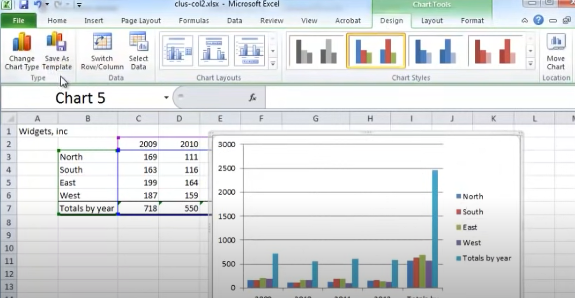
Clustered Column Chart in Excel
How to Insert a Clustered Column Chart in Excel?
To insert a clustered column chart in Excel, click on the Insert tab and then select the “Column Chart” option from the Chart group. Next, choose the “Clustered Column” chart type from the drop-down menu. You can also use the keyboard shortcut Alt + F1 to quickly create a clustered column chart. Once you have inserted the chart, you can customize it by adding data, labels, and titles, as well as adjusting the chart’s appearance and formatting. To insert a clustered column chart in Excel, click on the Insert tab and then select the “Column Chart” option from the Chart group. Next, choose the “Clustered Column” chart type from the drop-down menu.
You can also use the keyboard shortcut Alt + F1 to quickly create a clustered column chart. Once you have inserted the chart, you can customize it by adding data, labels, and titles, as well as adjusting the chart’s appearance and formatting. To insert a clustered column chart in Excel, click on the Insert tab and then select the “Column Chart” option from the Chart group. Next, choose the “Clustered Column” chart type from the drop-down menu. You can also use the keyboard shortcut Alt + F1 to quickly create a clustered column chart.
Conclusion: Mastering Clustered Column Charts
Congratulations! You’ve reached the end of this comprehensive guide on creating clustered column charts in Excel. These charts are invaluable for conveying complex data in a visually compelling way, whether for business reports, academic presentations, or personal projects.
As you continue to refine your Excel skills, remember that practice and experimentation are key. Explore different datasets, experiment with chart variations, and continually improve your proficiency. Excel is your trusted companion for data visualization, and with each chart you create, you’re one step closer to mastery.
If you have any questions or need further assistance, please don’t hesitate to reach out. Happy charting!
Hello, I’m Cansu, a professional dedicated to creating Excel tutorials, specifically catering to the needs of B2B professionals. With a passion for data analysis and a deep understanding of Microsoft Excel, I have built a reputation for providing comprehensive and user-friendly tutorials that empower businesses to harness the full potential of this powerful software.
I have always been fascinated by the intricate world of numbers and the ability of Excel to transform raw data into meaningful insights. Throughout my career, I have honed my data manipulation, visualization, and automation skills, enabling me to streamline complex processes and drive efficiency in various industries.
As a B2B specialist, I recognize the unique challenges that professionals face when managing and analyzing large volumes of data. With this understanding, I create tutorials tailored to businesses’ specific needs, offering practical solutions to enhance productivity, improve decision-making, and optimize workflows.
My tutorials cover various topics, including advanced formulas and functions, data modeling, pivot tables, macros, and data visualization techniques. I strive to explain complex concepts in a clear and accessible manner, ensuring that even those with limited Excel experience can grasp the concepts and apply them effectively in their work.
In addition to my tutorial work, I actively engage with the Excel community through workshops, webinars, and online forums. I believe in the power of knowledge sharing and collaborative learning, and I am committed to helping professionals unlock their full potential by mastering Excel.
With a strong track record of success and a growing community of satisfied learners, I continue to expand my repertoire of Excel tutorials, keeping up with the latest advancements and features in the software. I aim to empower businesses with the skills and tools they need to thrive in today’s data-driven world.
Suppose you are a B2B professional looking to enhance your Excel skills or a business seeking to improve data management practices. In that case, I invite you to join me on this journey of exploration and mastery. Let’s unlock the true potential of Excel together!
https://www.linkedin.com/in/cansuaydinim/

