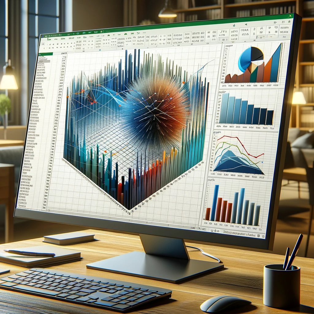
Can You Make a 3D Plot in Excel? Learn to Create XYZ Plots, 3D Models, and 3D Maps
How to Create a 3D Plot in Excel?
Building Your First 3D Map
Creating a 3D map in Excel requires a few steps, but the results are worth it. Here’s how to build your first 3D map:
- Data Setup: Ensure your data contains geographical coordinates (latitude, longitude) and a variable of interest that you want to visualize in 3D, such as population density or temperature.
- Insert 3D Map: Go to the ‘Insert’ tab, select ‘3D Maps,’ and choose ‘Open 3D Maps.’ This will open a new window for map creation.
- Adding Data Layers: Import your data into the 3D Maps window. Specify the latitude and longitude fields, and assign the variable of interest to the ‘Height’ option. You can also add additional data layers for more context.
- Customization: Customize your 3D map by adjusting the appearance, including color schemes, legends, and labels. You can also manipulate the viewing angle to explore different perspectives.
For instance, if you’re studying climate data, you can create a 3D map that displays temperature variations across a region, allowing you to visualize temperature changes in relation to geography.
Frequently Asked Questions
How do I enable 3D plotting in Excel?
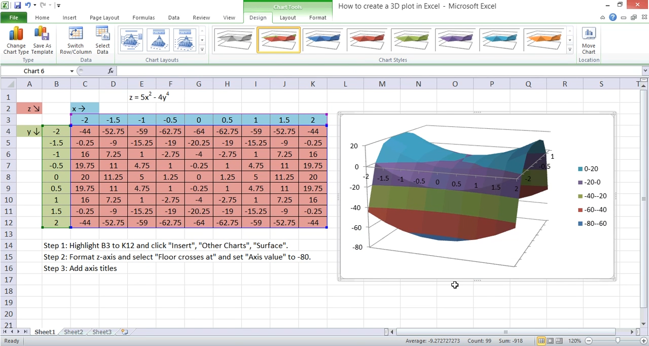
How to Make a 3D Graph on Excel? To enable 3D plotting in Excel, you need to have Microsoft 365 or Excel 2019 installed. Once you have the software, you can create 3D plots by selecting your data, going to the ‘Insert’ tab, and choosing ‘3D Plot.’
Can I create custom 3D models in Excel?
Yes, Excel allows you to create custom 3D models using the 3D Model command. You can customize the appearance and properties of these models to suit your needs. For example, you can design custom 3D models for architectural visualization or product design.
What data is suitable for 3D mapping in Excel?
3D mapping in Excel is ideal for geographic data that includes latitude, longitude, and a variable of interest, such as population or temperature. You can create 3D maps to represent topography, urban development, or environmental factors.
Are there any Excel add-ins for advanced 3D plotting?
Yes, several Excel add-ins are available that can enhance your 3D plotting capabilities. Some popular options include ‘Excel 3D Plot Add-In’ and ‘XYZ Mesh.’ These add-ins offer advanced features for creating and customizing 3D plots.
How can I export my 3D plots from Excel?
You can export your 3D plots from Excel as image files or 3D models. How to Make a 3D Graph on Excel? Simply right-click on the plot, select ‘Save as Picture’ or ‘Save 3D Model,’ and choose your desired format. This allows you to share your 3D visualizations with others or use them in presentations and reports.
The Ultimate Guide to What Is Fault Tree Analysis And How To Perform It 2023 – projectcubicle
Can Excel handle large datasets for 3D plotting?
Excel has limitations when it comes to handling large datasets for excel three dimensional chart plotting. It’s recommended to preprocess and reduce the data size if necessary to ensure smooth plotting. Techniques like data filtering and aggregation can help manage large datasets more effectively.
Conclusion
How to Make a 3D Graph on Excel? In this extensive guide, we’ve explored the realm of excel three dimensional chart plotting in Excel, spanning from the basics of 3D plots and XYZ plots to designing captivating excel three dimensional chart models and building informative excel three dimensional chart maps. Armed with this knowledge, you now have the tools to take your data visualization to the next dimension.
Whether you’re visualizing scientific data, creating 3D objects for design or education, or mapping geographic information, Excel’s excel three dimensional chart capabilities empower you to excel in the world of 3D visualization.
Unlock the power of Excel’s 3D tools and watch your data come to life. Start creating excel three dimensional chart plots, mastering XYZ plots, designing captivating 3D models, and building informative 3D maps today!

Thank you dear reader!
Hello, I’m Cansu, a professional dedicated to creating Excel tutorials, specifically catering to the needs of B2B professionals. With a passion for data analysis and a deep understanding of Microsoft Excel, I have built a reputation for providing comprehensive and user-friendly tutorials that empower businesses to harness the full potential of this powerful software.
I have always been fascinated by the intricate world of numbers and the ability of Excel to transform raw data into meaningful insights. Throughout my career, I have honed my data manipulation, visualization, and automation skills, enabling me to streamline complex processes and drive efficiency in various industries.
As a B2B specialist, I recognize the unique challenges that professionals face when managing and analyzing large volumes of data. With this understanding, I create tutorials tailored to businesses’ specific needs, offering practical solutions to enhance productivity, improve decision-making, and optimize workflows.
My tutorials cover various topics, including advanced formulas and functions, data modeling, pivot tables, macros, and data visualization techniques. I strive to explain complex concepts in a clear and accessible manner, ensuring that even those with limited Excel experience can grasp the concepts and apply them effectively in their work.
In addition to my tutorial work, I actively engage with the Excel community through workshops, webinars, and online forums. I believe in the power of knowledge sharing and collaborative learning, and I am committed to helping professionals unlock their full potential by mastering Excel.
With a strong track record of success and a growing community of satisfied learners, I continue to expand my repertoire of Excel tutorials, keeping up with the latest advancements and features in the software. I aim to empower businesses with the skills and tools they need to thrive in today’s data-driven world.
Suppose you are a B2B professional looking to enhance your Excel skills or a business seeking to improve data management practices. In that case, I invite you to join me on this journey of exploration and mastery. Let’s unlock the true potential of Excel together!
https://www.linkedin.com/in/cansuaydinim/


