How to Control Charts in Excel: A Comprehensive Guide
Control charts in Excel are crucial for monitoring and improving processes in various industries, including manufacturing, healthcare, and finance. They help identify data trends, patterns, and outliers, allowing decision-makers to take corrective action and improve overall performance. In this article, we will explore the concept of control charts in Excel and show you how to create them step-by-step.
Table of Contents

How to Control Charts in Excel
What are Control Charts?
A control chart is a statistical tool that graphically displays data over time and helps detect any changes or variations in a process. It is based on the principle that all processes have inherent variability, which can be classified into common cause variation and special cause variation.
Common cause variation is inherent in the process and results from natural factors such as temperature, humidity, or machine wear and tear. It is considered normal within certain limits, and the process is said to be in control when the variation is within these limits.
Special cause variation, on the other hand, is caused by external factors such as human error, equipment malfunction, or a change in the process. It is considered abnormal and can cause the process to go out of control.

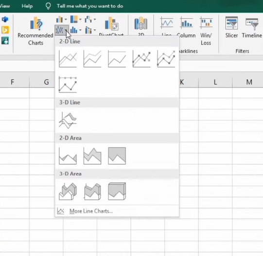
Select 2D Excel Charts
Types of Control Charts in Excel
Control charts are graphical representations that help track the progress of a process over time. Consequently, they serve as useful tools for detecting variations that may suggest that a process is not performing as expected. In Excel, several control charts are available, which can be utilized for various purposes.
There are four main types of control charts available in Excel. Firstly, the High-Low-Close Control Chart displays the high, low, and close values of a process over time. This chart is useful for identifying trends and patterns in data. Secondly, the Open-High-Low-Close Control Chart shows the open, high, low, and close values of a process over time.
This chart is useful for identifying variations in data that may indicate changes in the process. Thirdly, the Volume-High-Low-Close Control Chart displays the volume, high, low, and close values of a process over time. It is useful for identifying changes in process volume that may affect performance. Finally, the Volume-Open-High-Low-Close Control Chart shows the volume, open, high, low, and close values of a process over time. It is useful for identifying changes in process volume and how they influence performance.
Overall, control charts in Excel are powerful tools for supervising process performance and identifying variations that may indicate issues. In addition, they are simple to create and can be customized to suit different users’ requirements.
Creating Control Charts in Excel:
Excel is a powerful tool for creating control charts and analyzing data. Here’s how you can create a control chart in Excel:
Step 1: Collect Data
The first step is to collect data on the process you want to monitor. This could be anything from the number of defects in a manufacturing process to the time it takes to complete a task.
Step 2: Calculate Mean and Standard Deviation
The next step is to calculate the mean and standard deviation of the data. The mean is the average of the data, and the standard deviation is a measure of how spread out the data is. You can calculate these values using the AVERAGE and STDEV functions in Excel.
Step 3: Create Control Chart
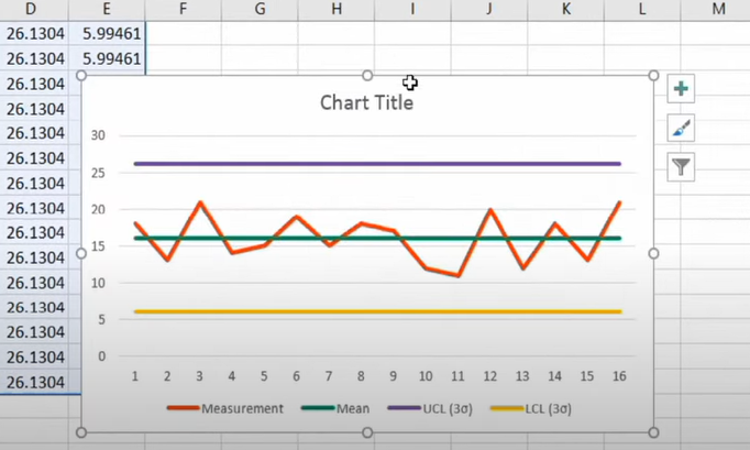
Once you have calculated the mean and standard deviation, you can create the control chart. There are two types of control charts: the X-bar chart and the R chart. The X-bar chart shows the average of the data over time, while the R chart shows the range of the data over time.
To create a control chart in Excel, you need to:
- Select the data you want to use
- Click on the Insert tab
- Click on the Line chart icon
- Select the Line chart with Markers option
- Right-click on the chart and select Select Data
- Click on Add under Legend Entries (Series)
- Enter a name for the series and select the data for the series
- Click OK
- Right-click on the new series and select Change Series Chart Type
- Select the Line chart with Markers option
- Click OK
Step 4: Add Control Limits
The next step is to add control limits to the chart. Control limits are calculated based on the mean and standard deviation of the data and represent the upper and lower limits within which the process is expected to operate. You can use the following formulas to calculate control limits:
Upper Control Limit (UCL) = Mean + 3 x Standard Deviation Lower Control Limit (LCL) = Mean – 3 x Standard Deviation
To add control limits to the chart, you need to:
- Right-click on the chart and select Select Data
- Click on Add under Legend Entries (Series)
- Enter a name for the series and select the UCL data for the series
- Click OK
- Right-click on the new series and select Change Series Chart Type
- Select the Line chart option
- Click OK
- Repeat steps 2-6 for the LCL
Step 5: Interpret the Chart
Once you have created the control chart, you can interpret the data and identify any patterns or trends in the ‘we’ form:
Interpreting the chart involves analyzing the data and identifying any points that fall outside the control limits or show unusual patterns. Points outside the control limits are considered out of control and require investigation to identify the cause of the variation.
If no points are outside the control limits and the data appears to be randomly distributed within the limits, the process is said to be in control. In this case, decision-makers can focus on maintaining the process and making small improvements over time.
However, if patterns or trends in the data suggest the process is changing, decision-makers may need to take corrective action to bring the process back into control. This could involve changing the process itself or identifying and eliminating special cause variation.
Conclusion:
In conclusion, control charts are essential for monitoring and improving processes in various industries. By using Excel to create control charts, decision-makers can identify trends, patterns, and outliers in data and take corrective action to improve overall performance.
By following the steps outlined in this article, you can create a control chart in Excel and interpret the data to make informed decisions about the process. Remember to collect data, calculate the mean and standard deviation, create the chart, add control limits, and interpret the results. By continually improving your understanding of control charts and other statistical tools, you can become a valuable asset to any organization and help drive continuous improvement.
Hello, I’m Cansu, a professional dedicated to creating Excel tutorials, specifically catering to the needs of B2B professionals. With a passion for data analysis and a deep understanding of Microsoft Excel, I have built a reputation for providing comprehensive and user-friendly tutorials that empower businesses to harness the full potential of this powerful software.
I have always been fascinated by the intricate world of numbers and the ability of Excel to transform raw data into meaningful insights. Throughout my career, I have honed my data manipulation, visualization, and automation skills, enabling me to streamline complex processes and drive efficiency in various industries.
As a B2B specialist, I recognize the unique challenges that professionals face when managing and analyzing large volumes of data. With this understanding, I create tutorials tailored to businesses’ specific needs, offering practical solutions to enhance productivity, improve decision-making, and optimize workflows.
My tutorials cover various topics, including advanced formulas and functions, data modeling, pivot tables, macros, and data visualization techniques. I strive to explain complex concepts in a clear and accessible manner, ensuring that even those with limited Excel experience can grasp the concepts and apply them effectively in their work.
In addition to my tutorial work, I actively engage with the Excel community through workshops, webinars, and online forums. I believe in the power of knowledge sharing and collaborative learning, and I am committed to helping professionals unlock their full potential by mastering Excel.
With a strong track record of success and a growing community of satisfied learners, I continue to expand my repertoire of Excel tutorials, keeping up with the latest advancements and features in the software. I aim to empower businesses with the skills and tools they need to thrive in today’s data-driven world.
Suppose you are a B2B professional looking to enhance your Excel skills or a business seeking to improve data management practices. In that case, I invite you to join me on this journey of exploration and mastery. Let’s unlock the true potential of Excel together!
https://www.linkedin.com/in/cansuaydinim/


