Excel Venn Diagram: Simplifying Data Visualization
Introduction
In the world of data analysis, visualizing complex information is key to understanding patterns, relationships, and overlaps. One powerful tool that aids in this process is the Excel Venn Diagram. This article explores the concept of Venn diagrams, how to create them using Excel, and their significance in simplifying data visualization. Whether you’re a beginner or an experienced Excel user, this guide will equip you with the knowledge and skills to leverage Venn diagrams effectively.
Table of Contents
Excel Venn Diagram: Explained
A Venn diagram is a visual representation of relationships between different sets or groups. It consists of overlapping circles or ellipses that showcase commonalities and differences among the sets. The Excel Venn Diagram feature allows you to create these diagrams directly within the Excel software, enabling you to analyze and present data visually appealing and intuitively.
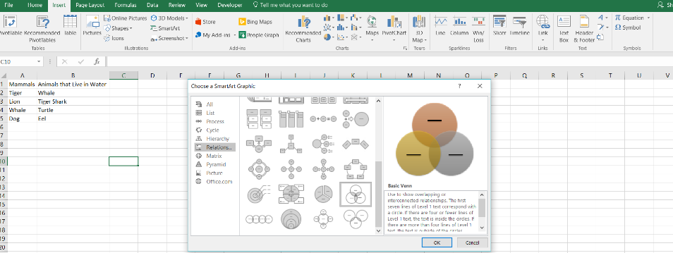
Excel Venn Diagram
How to Create an Excel Venn Diagram
To create an Excel Venn Diagram, follow these simple steps:
- Launch Microsoft Excel and open a new worksheet.
- Enter the data you want to represent in the diagram into separate columns.
- Select the data and navigate to the “Insert” tab in the Excel ribbon.
- Click on the “Insert” button and choose the “SmartArt” option.
- In the SmartArt dialog box, select the “Relationship” category.
- Choose the Venn diagram layout that best suits your needs.
- Customize the diagram by adding labels, changing colors, and adjusting the size.
- Add additional circles or ellipses to represent more sets, if required.
- Once you’re satisfied with the diagram, save your Excel workbook.
Case
- Open Microsoft Excel and create a new workbook.
- Enter your data in separate columns. For example, you have three sets: Set A, Set B, and Set C. Enter the data for each set in separate columns, with each item in a separate row. Make sure the column headers indicate the set names.
- Select the cells containing the data for all three sets. For example, if your data is in columns A, B, and C, select the cells from A2 to C6 (assuming the headers are in row 1, and the data starts from row 2).
- Click on the “Insert” tab in the Excel ribbon.
- In the “Illustrations” group, click on the “SmartArt” button.
- In the “Choose a SmartArt Graphic” window, select the “Relationship” category from the left panel.
- Choose the “Basic Venn” layout or any other Venn diagram layout that suits your needs, and click “OK”.
- A Venn diagram will be inserted into your worksheet. It will have the default overlapping circles corresponding to the number of sets you selected.
- To add the data labels, click on the diagram and then click on the “Design” tab in the SmartArt Tools section of the ribbon.
- In the “Create Graphic” group, click the “Text Pane” button. A pane will appear on the left side of the worksheet.
- In the text pane, replace the default text placeholders with the names of your sets (A, B, C).
- Customize the appearance of your Venn diagram using the various formatting options available in Excel.
- Add a title to your Venn diagram by clicking on it and typing the desired title directly on it or using the “Chart Title” option in the “Layout” tab.
- Save your workbook.
The Power of Excel
Excel offers several benefits when it comes to data visualization:
- Identifying overlaps: Venn diagrams help you identify common elements shared by different sets, making it easier to spot patterns and relationships. This is particularly useful in fields such as market research, where understanding the intersection between customer demographics and preferences can provide valuable insights.
- Comparing data: By visualizing data through overlapping circles, Excel Venn Diagrams allow for quick and easy comparisons. You can analyze the similarities and differences between different data sets, enabling you to make informed decisions and draw accurate conclusions.
- Simplifying complex information: Venn diagrams condense complex data into a clear and concise format. Instead of sifting through rows and columns of numbers, you can grasp the big picture at a glance. This simplification enhances comprehension and aids in presenting findings to stakeholders effectively.
- Enhancing collaboration: Venn diagrams serve as a visual aid in collaborative environments. When working with teams or clients, these diagrams facilitate discussions, encourage participation, and foster a shared understanding of data relationships.
FAQs about Excel Venn Diagrams
Q1: Can I create multiple Venn diagrams in a single Excel worksheet?
Yes, Excel allows you to create multiple Venn diagrams in a single worksheet. Simply follow the steps mentioned earlier for each diagram you want to create. You can also resize and reposition the diagrams as needed.
Q2: Can I import data from other Excel worksheets into a Venn diagram?
Absolutely! Excel can incorporate data from multiple sources within the same workbook. Also, you can import data from different worksheets or even different workbooks by referencing the cell ranges or using formulas.
Q3: Can I customize the appearance of the Venn diagram in Excel?
Certainly! Excel offers a range of customization options for Venn diagrams. You can modify colors, fonts, line styles, and add effects to make your diagrams visually appealing and aligned with your brand or presentation requirements.
Q4: Can I export Excel Venn Diagrams to other software or file formats?
Yes, Excel allows you to export your Venn diagrams to various file formats, such as PDF, PNG, or JPEG. Also, this feature enables you to share your diagrams with others who may not have Excel installed on their systems.
Q5: Are Venn diagrams only useful for mathematical or statistical data?
While Venn diagrams are commonly associated with mathematical and statistical data, their applications extend to various fields. From marketing to social sciences, business analysis to project management, Venn diagrams can help visualize relationships and make data-driven decisions across diverse domains.
Q6: Are there any Excel add-ins or plugins that enhance Venn diagram functionality?
Yes, several Excel add-ins and plugins are available to extend the capabilities of Excel Venn Diagrams. These tools offer advanced features such as labeling, data filtering, and interactive elements, allowing for more dynamic and interactive data visualization experiences.
Conclusion
In conclusion, Excel is powerful tool for simplifying data visualization. By representing relationships and overlaps between sets, these diagrams enable you to gain valuable insights, make informed decisions, and communicate complex information effectively. With Excel’s user-friendly interface and various customization options, creating Venn diagrams has never been easier. Whether you’re a data analyst, a business professional, or a student, mastering the art of Excel will undoubtedly enhance your ability to extract meaningful insights from your data.
Hello, I’m Cansu, a professional dedicated to creating Excel tutorials, specifically catering to the needs of B2B professionals. With a passion for data analysis and a deep understanding of Microsoft Excel, I have built a reputation for providing comprehensive and user-friendly tutorials that empower businesses to harness the full potential of this powerful software.
I have always been fascinated by the intricate world of numbers and the ability of Excel to transform raw data into meaningful insights. Throughout my career, I have honed my data manipulation, visualization, and automation skills, enabling me to streamline complex processes and drive efficiency in various industries.
As a B2B specialist, I recognize the unique challenges that professionals face when managing and analyzing large volumes of data. With this understanding, I create tutorials tailored to businesses’ specific needs, offering practical solutions to enhance productivity, improve decision-making, and optimize workflows.
My tutorials cover various topics, including advanced formulas and functions, data modeling, pivot tables, macros, and data visualization techniques. I strive to explain complex concepts in a clear and accessible manner, ensuring that even those with limited Excel experience can grasp the concepts and apply them effectively in their work.
In addition to my tutorial work, I actively engage with the Excel community through workshops, webinars, and online forums. I believe in the power of knowledge sharing and collaborative learning, and I am committed to helping professionals unlock their full potential by mastering Excel.
With a strong track record of success and a growing community of satisfied learners, I continue to expand my repertoire of Excel tutorials, keeping up with the latest advancements and features in the software. I aim to empower businesses with the skills and tools they need to thrive in today’s data-driven world.
Suppose you are a B2B professional looking to enhance your Excel skills or a business seeking to improve data management practices. In that case, I invite you to join me on this journey of exploration and mastery. Let’s unlock the true potential of Excel together!
https://www.linkedin.com/in/cansuaydinim/

