Excel Tutorials: Understanding the Components of a Gauge Chart
A gauge chart, also known as a speedometer or dial chart, is an essential tool in data visualization, allowing users to represent data within a specific range of values in a clear and concise manner. In Excel, creating a gauge chart can greatly enhance your reports and presentations by providing a visually appealing and easy-to-understand representation of your data. We know this is difficult to do. We have prepared a nice tutorial for you as a Project Cubicle.
Table of Contents
Gauge Chart Step 1
What is a Gauge Chart?
A gauge chart is a type of chart that visually represents data in a circular format, similar to a car’s speedometer. It consists of a dial, a needle, and a value range, with the needle pointing to the data value on the dial. Also, Gauge charts are commonly used to represent performance or progress toward a specific goal.
Example: For instance, a company can use a gauge chart to represent its monthly sales performance. Also, if the company has a monthly sales goal of $100,000, the gauge chart can visually represent how close the company is to achieving its goal, with the needle pointing to the actual sales value on the dial.
Gauge Chart Step 2
Importance of Gauge Chart in Excel
Excel is renowned for its robust charting capabilities; the gauge chart is no exception. By leveraging Excel’s features, you can create a gauge chart that precisely represents your data, helping you to assess performance or progress quickly. Also, the gauge chart is an invaluable tool for businesses and individuals alike, as it enables the user to make informed decisions based on a clear visual representation of their data.
Gauge Chart Step 3
Understanding the Components of a Gauge Chart
The gauge chart comprises three main components: the dial, the needle, and the value range. Each of these plays a crucial role in accurately representing your data.
- The Dial: The dial is the circular component of the gauge chart that displays the range of values. Also, it is divided into various sections, with each section representing a specific range of values. The sections can be color-coded to represent different performance levels, such as red for poor, yellow for average, and green for good.
- The Needle: The needle is the component that points to the actual value within the dial, similar to the needle in a car’s speedometer. It moves across the dial to indicate the current value of your data, providing a quick visual reference of where your data falls within the value range.
- The Value Range: The value range is the set of values that your data can fall within. Also, it is crucial to set an appropriate value range to accurately represent your data. The range should be wide enough to encompass all possible values but not so wide that it dilutes the impact of the data representation.
Steps to Create a Gauge Chart in Excel
Creating a gauge chart in Excel is a straightforward process, but it requires careful attention to detail to ensure accuracy.
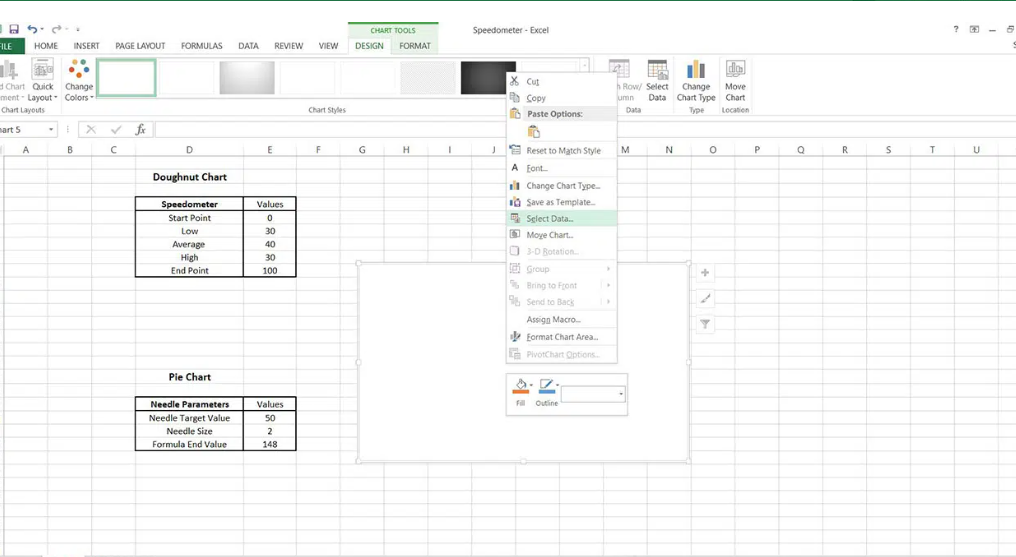
- Preparing the Data: Start by organizing your data in a table format. Ensure that you have a clear understanding of the value you want to represent and the range it falls within. This step is crucial as it sets the foundation for your gauge chart.
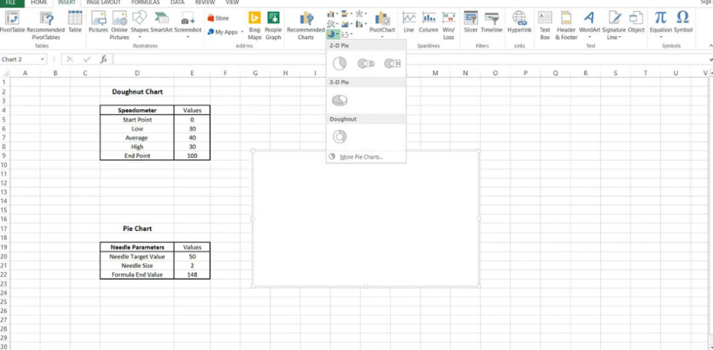
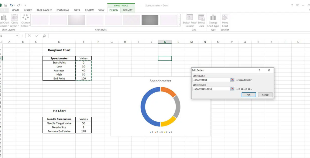
- Creating a Doughnut Chart: Once your data is organized, select your data range and choose the ‘Doughnut Chart’ option from the Excel chart types. The doughnut chart is the basis for the gauge chart, and it provides a circular representation of your data.
- Adding the Needle: The next step is to add the needle to your doughnut chart. Also, this is done by creating a series of data that represents the needle and then formatting it to resemble a needle. Also, the needle should be positioned accurately to represent your data value.
- Formatting the Gauge Chart: The final step is to format your gauge chart. This involves adjusting the colors, labels, and other elements to make the chart visually appealing and easy to understand. Take the time to fine-tune these elements to ensure that your gauge chart accurately represents your data and is easy to interpret.
Example 1: Monthly Sales Performance
A retail store has set a monthly sales goal of $100,000. Also, by the end of the month, the store had made $75,000 in sales. Also, the store can create a gauge chart to visually represent its sales performance.
- Dial: The dial would range from $0 to $100,000, representing the possible range of monthly sales.
- Needle: The needle would point to $75,000, indicating the actual sales made by the store.
- Value Range: The value range would be from $0 to $100,000, which is the sales goal set by the store.
- Colors: The dial could be color-coded with red for $0 to $33,000 (poor sales), yellow for $33,000 to $66,000 (average sales), and green for $66,000 to $100,000 (good sales).
Example 2: Employee Performance Evaluation
A company evaluates its employees on a scale of 1 to 10, with 10 being the highest performance level. Also, an employee scored 7 in the evaluation. The company can use a gauge chart to represent the employee’s performance.
- Dial: The dial would range from 1 to 10, representing the possible range of performance scores.
- Needle: The needle would point to 7, indicating the employee’s performance score.
- Value Range: The value range would be from 1 to 10, which is the performance scale used by the company.
- Colors: The dial could be color-coded with red for 1 to 3 (poor performance), yellow for 4 to 6 (average performance), and green for 7 to 10 (good performance).
Example 3: Project Completion Status
A project manager is overseeing a project that is scheduled to be completed in 12 months. Also, at the 8-month mark, the project is 75% complete. The project manager can create a gauge chart to represent the project’s completion status.
- Dial: The dial would range from 0% to 100%, representing the possible range of project completion.
- Needle: The needle would point to 75%, indicating the current completion status of the project.
- Value Range: The value range would be from 0% to 100%, which represents the full completion of the project.
- Colors: The dial could be color-coded with red for 0% to 33% (behind schedule), yellow for 34% to 66% (on schedule), and green for 67% to 100% (ahead of schedule).
Tips and Tricks for a Perfect Gauge Chart
Creating a perfect gauge chart requires attention to detail and a keen eye for design. Also,here are some tips and tricks to help you create an effective gauge chart:
- Choosing the Right Colors: Colors are a crucial element of any chart, and the gauge chart is no exception. Also, choose colors that contrast well and represent the data accurately. For example, use green for good performance, yellow for average performance, and red for poor performance.
- Adjusting the Needle Thickness: The thickness of the needle is an important aspect of the gauge chart. Also, it should be thick enough to be visible but not so thick that it overshadows the other elements of the chart.
- Optimizing the Value Range: The value range should be set accurately to represent your data. Also, it should be wide enough to encompass all possible values but not so wide that it dilutes the impact of the data representation.
Common Mistakes to Avoid
Creating a gauge chart in Excel is not without its challenges. Here are some common mistakes to avoid:
- Incorrect Data Range: One of the most common mistakes is setting an incorrect data range. Also, this can lead to a misleading representation of your data.
- Inappropriate Chart Type: Another mistake is choosing the wrong chart type. Also, select the ‘Doughnut Chart’ option for creating a gauge chart.
- Poorly Adjusted Needle: The needle should be properly adjusted to accurately represent your data. Also, if it’s not aligned correctly, it can give a wrong impression of your data’s value.
Conclusion
In conclusion, a gauge chart in Excel can be a powerful tool to visually represent your data within a specific range of values. By following the steps and tips provided, you can create an effective and visually appealing gauge chart that accurately represents your data and helps you make informed decisions.
FAQs
-
What is the significance of colors in a gauge chart?
- Colors in a gauge chart are used to represent different performance levels or ranges. For example, green can be used to represent good performance, yellow for average performance, and red for poor performance.
-
Can I create a gauge chart in other spreadsheet software?
- Yes, you can create a gauge chart in other spreadsheet software that offers similar charting capabilities to Excel.
-
How do I adjust the needle thickness in a gauge chart?
- The thickness of the needle can be adjusted by selecting the needle series and formatting its line style or thickness in the chart formatting options.
-
What should I do if my data falls outside the value range?
- If your data falls outside the value range, you should adjust the value range of your gauge chart to ensure that it accurately represents your data.
-
Can I use a gauge chart to represent multiple data points?
- While it is possible to represent multiple data points in a gauge chart, it is generally not recommended as it can make the chart cluttered and difficult to interpret. Also, a gauge chart is best used to represent a single data point or value.
Hello, I’m Cansu, a professional dedicated to creating Excel tutorials, specifically catering to the needs of B2B professionals. With a passion for data analysis and a deep understanding of Microsoft Excel, I have built a reputation for providing comprehensive and user-friendly tutorials that empower businesses to harness the full potential of this powerful software.
I have always been fascinated by the intricate world of numbers and the ability of Excel to transform raw data into meaningful insights. Throughout my career, I have honed my data manipulation, visualization, and automation skills, enabling me to streamline complex processes and drive efficiency in various industries.
As a B2B specialist, I recognize the unique challenges that professionals face when managing and analyzing large volumes of data. With this understanding, I create tutorials tailored to businesses’ specific needs, offering practical solutions to enhance productivity, improve decision-making, and optimize workflows.
My tutorials cover various topics, including advanced formulas and functions, data modeling, pivot tables, macros, and data visualization techniques. I strive to explain complex concepts in a clear and accessible manner, ensuring that even those with limited Excel experience can grasp the concepts and apply them effectively in their work.
In addition to my tutorial work, I actively engage with the Excel community through workshops, webinars, and online forums. I believe in the power of knowledge sharing and collaborative learning, and I am committed to helping professionals unlock their full potential by mastering Excel.
With a strong track record of success and a growing community of satisfied learners, I continue to expand my repertoire of Excel tutorials, keeping up with the latest advancements and features in the software. I aim to empower businesses with the skills and tools they need to thrive in today’s data-driven world.
Suppose you are a B2B professional looking to enhance your Excel skills or a business seeking to improve data management practices. In that case, I invite you to join me on this journey of exploration and mastery. Let’s unlock the true potential of Excel together!
https://www.linkedin.com/in/cansuaydinim/

