Create a PivotChart: Creating Your First PivotChart (Using Microsoft Excel)
Ever felt overwhelmed by spreadsheets overflowing with numbers? Drowning in data is a common struggle, but fear not! Also, when you create a PivotTable, a pane called the PivotTable Fields list appears on the right side of your spreadsheet window by default (this behavior may vary slightly depending on the software you’re using). This pane displays a list of all the fields available in your source data. Each field name is typically accompanied by a checkbox. PivotCharts are here to transform your data into clear, concise visuals. This guide unveils the magic of PivotCharts, empowering you to unlock insights and impress with data-driven presentations.
Table of Contents
What is a PivotChart?
As you mentioned, PivotCharts are like dynamic infographics built from your spreadsheet data. They offer a significant leap forward from static charts by incorporating interactivity and summarization. Here’s a breakdown of their key features:
- Summarization: PivotCharts condense large datasets, focusing on the bigger picture. You can group and categorize your data in various ways to identify trends and patterns that might be hidden in raw numbers.
- Flexibility: Unlike static charts linked to specific cells, PivotCharts are dynamic. By dragging and dropping fields within the PivotTable, you can rearrange the data and instantly see the reflected changes in the chart. This allows you to explore your data from multiple angles without recreating charts from scratch.
- Customization: PivotCharts offer a variety of chart types (bar, column, line, pie, etc.) to best suit the message you want to convey. You can customize fonts, colors, and layouts to enhance clarity and visual impact.
- Interaction: PivotCharts are interactive! Use slicers and filters to focus on specific data subsets within the chart itself. This interactivity allows you to drill down into areas of interest and analyze different scenarios without switching between your data and the chart.
Why Use PivotCharts?
-
Effortless Data Summarization: PivotCharts condense large datasets into digestible formats, revealing patterns and trends at a glance. For example, instead of manually comparing sales figures across different regions and product categories in a massive table (PivotTable Fields), a PivotChart can instantly show you which region generates the highest sales for each product category.
-
Interactive Exploration: Effortlessly switch between different data categories, allowing for in-depth analysis without complex formulas. Imagine a PivotChart analyzing sales data. You can quickly switch between viewing sales by product category, salesperson, or even by day of the week. This interactivity allows you to drill down into specific areas and uncover hidden insights.
-
Enhanced Communication: Present complex data in a visually compelling way, making it easier for audiences to grasp key takeaways. Charts are far more engaging than raw numbers in tables. A well-designed PivotChart can clearly communicate trends, outliers, and relationships within your data, leaving a lasting impression on your audience.

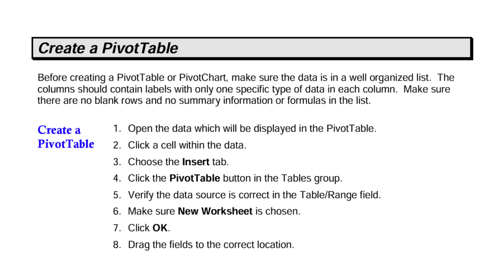
create a pivot tables
PivotCharts vs. Static Charts:
While static charts can represent data, PivotCharts offer a significant advantage: interactivity. Static charts are like snapshots, whereas PivotCharts are dynamic, allowing you to explore your data from multiple angles. This makes PivotCharts ideal for complex datasets where you want to uncover hidden trends and relationships.
Tips & Tricks:
- Start Simple: Begin with a basic PivotChart to understand the core functionality. As you gain confidence, experiment with more complex layouts and filtering techniques.
- Clear & Concise Labeling: Ensure your PivotChart has clear labels for titles, axes, and data points. This improves readability and ensures your audience understands the information presented.
- Context is Key: Always provide context along with your PivotChart. Briefly explain what the chart represents and the key takeaways you want your audience to remember.

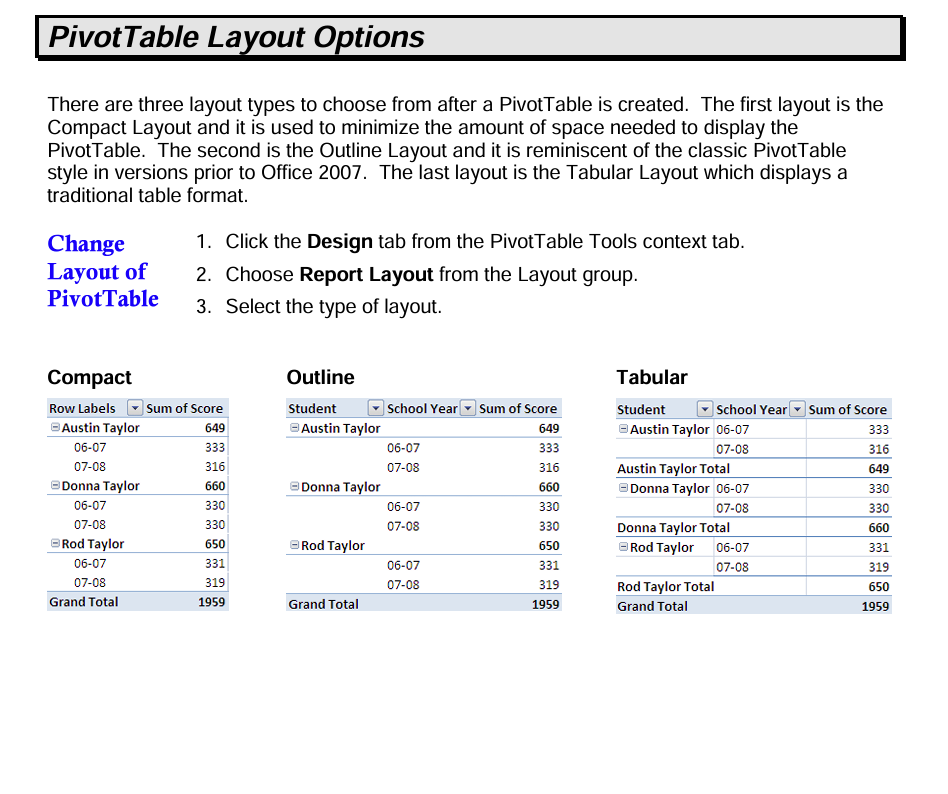
PivotTable layout options
Creating Your First PivotChart (Using Microsoft Excel):
- Prepare Your Data: Ensure your data is organized in a tabular format with clear column headers. Each row represents a single data point, and columns represent different data categories (e.g., product, sales rep, region).
- Select Your Data: Click any cell within your data table (PivotTable Fields). This tells Excel where to look for the magic.
- Insert the PivotChart: Navigate to the Insert tab and locate the Charts section. Click the PivotChart icon.
- Choose Your Chart Type: Excel offers various chart options depending on your data and preferences. Bar charts are excellent for comparisons, while pie charts showcase categorical proportions.
- Drag & Drop Customization: The PivotTable Fields pane appears. Drag and drop fields into the Rows, Columns, and Values sections to customize your chart’s layout. Rows: Categorizes data (e.g., product names).
- Columns: Groups data by another category (e.g., month).
- Values: Selects how data is summarized (e.g., sum of sales).
PivotChart Power Up!
- Filtering: Refine your chart’s focus by filtering specific categories within the PivotTable Fields pane.
- Slicing & Dicing: Interactively change the perspective of your chart by clicking on different data points.
- Formatting: Excel provides a wealth of formatting options to enhance your PivotChart’s visual appeal and clarity.
Pivot Table Change Data Source: Change the source data for a PivotTable
PivotCharts: Your Gateway to Data Visualization
Mastering PivotCharts empowers you to transform raw data into impactful visuals. By simplifying complex information, you can make informed decisions, identify opportunities, and communicate insights with confidence. So, next time you’re wrangling data, remember the power of PivotCharts!
PivotChart Examples in Action:
Here are some examples showcasing how PivotCharts can be used to analyze data in different contexts:
Sales Analysis:
- Data: Imagine a spreadsheet containing sales data for different product categories across various regions and months.
- PivotChart: Create a PivotChart with “Product Category” in the rows and “Sales Amount” in the values area. You can further segment the data by adding “Region” as a filter. This allows you to visualize which product categories are top sellers in each region and how sales trends vary across different locations.
Marketing Campaign Performance:
- Data: A dataset might track the performance of various marketing campaigns across different channels (e.g., email, social media, web ads) and include metrics like clicks, conversions, and cost per acquisition.
- PivotChart: Build a PivotChart with “Campaign Name” in the columns and “Clicks” or “Conversions” in the values area. Use a slicer for “Channel” to see how each campaign performs on different channels. This helps identify high-performing campaigns and optimize strategies for each channel.
Human Resources:
- Data: An HR department might maintain employee data with details like department, position, salary range, and years of experience.
- PivotChart: A PivotChart with “Department” on the rows and “Average Salary” in the values area can reveal salary trends across different departments. You can add a filter for “Years of Experience” to see how experience level affects salaries within each department. This allows for informed compensation decisions.
Hello, I’m Cansu, a professional dedicated to creating Excel tutorials, specifically catering to the needs of B2B professionals. With a passion for data analysis and a deep understanding of Microsoft Excel, I have built a reputation for providing comprehensive and user-friendly tutorials that empower businesses to harness the full potential of this powerful software.
I have always been fascinated by the intricate world of numbers and the ability of Excel to transform raw data into meaningful insights. Throughout my career, I have honed my data manipulation, visualization, and automation skills, enabling me to streamline complex processes and drive efficiency in various industries.
As a B2B specialist, I recognize the unique challenges that professionals face when managing and analyzing large volumes of data. With this understanding, I create tutorials tailored to businesses’ specific needs, offering practical solutions to enhance productivity, improve decision-making, and optimize workflows.
My tutorials cover various topics, including advanced formulas and functions, data modeling, pivot tables, macros, and data visualization techniques. I strive to explain complex concepts in a clear and accessible manner, ensuring that even those with limited Excel experience can grasp the concepts and apply them effectively in their work.
In addition to my tutorial work, I actively engage with the Excel community through workshops, webinars, and online forums. I believe in the power of knowledge sharing and collaborative learning, and I am committed to helping professionals unlock their full potential by mastering Excel.
With a strong track record of success and a growing community of satisfied learners, I continue to expand my repertoire of Excel tutorials, keeping up with the latest advancements and features in the software. I aim to empower businesses with the skills and tools they need to thrive in today’s data-driven world.
Suppose you are a B2B professional looking to enhance your Excel skills or a business seeking to improve data management practices. In that case, I invite you to join me on this journey of exploration and mastery. Let’s unlock the true potential of Excel together!
https://www.linkedin.com/in/cansuaydinim/


