Why Your Business Goals Should Guide Logo Designs
If you are a business owner or designer in the branding or marketing business, you have probably come across varied opinions on the look of a logo update. While many of them aren’t pleasant, the majority of them lack any thought into the business goals behind the redesign and starting to create a logo. Many people engage in deep comparisons of logo designs of famous companies and organizations. One that’s gained a lot of attention in recent years is the 2017 redesign of the Formula One Racing logo. The 2001 black and red logo, already an upgrade from the 1987 logo, was starting to feel dated.
Table of Contents
While it had been seent used on banners, race flags, etc., it didn’t really create a lasting identity in the digital era. It was just a mark superimposed on top of an image. Today, the F1 logo stands out significantly thanks to its simple, modern redesign.
Like most fanbases, F1 fans had diverse opinions about the new logo as seen below:
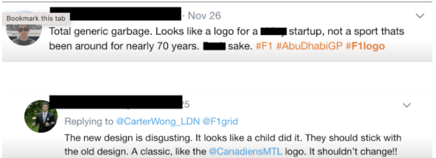
Unfortunately, many of these people don’t understand the soul and crux of design in the marketing space. They make comments without considering important factors that professional branding experts spend months on before finalizing a particular logo design choice.
Let’s look at a piece of expert advice from a renowned branding agency in Houston.
“When creating a distinct logo, you have to think about it as part of a system. There are several scopes of applications you need to consider for achieving a universally working result. A few of those considerations include to see how flexible the design is, what kinds of components you can deconstruct from it and how it could be used elsewhere to convert it into a rich tapestry of design.”
Who Designed The F1 Logo
The new F1 logo was designed by Wieden + Kennedy, who count Nike (they also wrote the tagline “Just do it”), Old Spice, Coca-Cola, and Levi’s as clients. The Old Spice success story really stands out. Old Spice was losing ground to newcomers like Axe Body Spray before teaming up with Wieden + Kennedy. With a fresh approach, Old Spice regained attention, putting the brand back on the map and winning a ton of awards for the “Smell like a man” campaign.
Firstly, the main purpose to create a logo is to identify. That is all there is to it. Business owners frequently believe that their logo design should describe or clarify what their company does. As a result, the major purpose of a small business logo is to distinguish itself. Your logo is intended to assist new and existing customers in recognizing your company. It serves as a reminder to customers about the origins of a product. Rather than having a logo that explicitly describes what your company does, go for a logo design that conveys the emotions and image you want to be associated with your company.
Design Strategy
Let’s look at WK’s F1 rebrand design brief. The objective of Formula One rebranding was to redefine the outlook as a forward-facing sports and entertainment brand that operates across a multitude of media channels. The primary consideration was to create a logo that you could easily integrate onto any platform.

Look at how the logo fits perfectly on that champagne bottle.
The Process of Logo Designs
Experts put a significant amount of time and care into evolving a logo that’s been around for years. There are no shortcuts when it comes to a redesign like WK’s work for F1. They explore several options, have discussions with the client, and ultimately arrive at a solution together.
The Result
The new logo design is much more pliable. It successfully creates impact and recall, especially when it comes to merchandising in the digital space.
Today, everybody needs to think of themselves as media companies in the new digital era. You can see how the simple, modern F1 logo can take forms in many different ways. It can work as a pattern as easily as an abstract graphic.
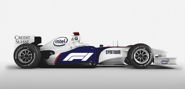
Look how beautifully the Formula One logo fits on the car below. It doesn’t compete against other elements of the overall design language of the automobile. The genius of the mark is that it’s camouflaged and yet contributes to the overall aesthetic while maintaining the brand identity. The shapes and lines indicate speed, power and torque but do not shout “F1 logo! Look at me!”
Summary for Business Logo Designs
So, branding experts routinely come across conversations on how perfect or “awful” logos they have worked on are. It’s unfortunate to watch a significant bunch of our creative community choose this type of discourse on social media platforms. Many of these commenters don’t realize that the design correlates to a multitude of business-oriented factors.
Michael Beirut, a renowned graphic designer, design critic and educator, famously said, “Most people comment on the logo launches as if they’re judging a diving competition, when they should be judging a swimming competition. It’s like swimming laps. It’s a long-distance thing”.
As it becomes easier for everyone to share their voice, more and more people feel the need to share their unsolicited opinions on branding choices with no regard for the time and effort the designers put in. Doing so means losing out on the true essence of design and its purpose. Branding and design in marketing relate to business goals. It’s imperative that we meet those business goals and create an impact with good design.

David is a dynamic, analytical, solutions-focused bilingual Financial Professional, highly regarded for devising and implementing actionable plans resulting in measurable improvements to customer acquisition and retention, revenue generation, forecasting, and new business development.

