Understanding Mekko Charts
In the competitive world of business, developing keen analytical insights remains paramount in determining growth. Many businesses rely on data visualization tools to understand their performance. One such tool for data visualization is the Mekko Chart. Mekko charts allow for a more detailed and clearer data representation, making decision-making more efficient and accurate. In this article, we delve into the benefits of Mekko Charts for measuring corporate performance and growth. So, how to create a mekko chart in excel and in other formats?
Table of Contents
What is a Mekko chart used for?
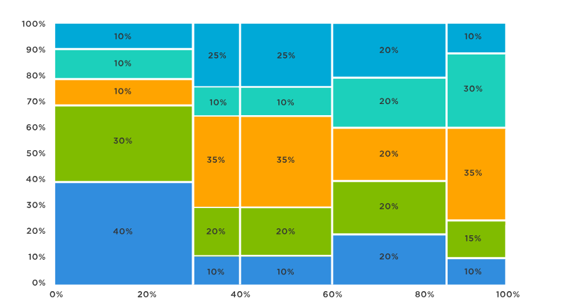
A Mekko chart, also known as a Marimekko chart, is used to display data in a two-dimensional stacked chart format. It combines the features of a bar chart and a stacked chart, allowing for the representation of multiple variables and their proportions within different categories or segments.
What is another name for a Mekko chart?
Another name for a Mekko chart is a Marimekko chart. The term “Marimekko” is derived from a Finnish design company that popularized this type of chart. It is also sometimes referred to as a mosaic plot due to its visual resemblance to a mosaic.
-
Understanding Mekko Charts

Mekko charts are specialized business tools that visualize multi-dimensional data in a single graphic. They are used extensively for evaluating market trends and understanding the competitive landscape. The relevance Mekko charts bring to corporate measurements is enormous due to the inclusion of numerous variables in a single chart.
Unlike simple bar or line charts, they present data in a more structured and comprehensive manner. They take into account the multiple factors influencing business performance, thereby resulting in more precise corporate measurements.
These charts enable critical decisions to be based on an overview of complex data rather than singular data points. As a result, businesses can gain a holistic view of their operations and market position.
-
The Role of Mekko Charts in Business Performance Analysis
Mekko charts play an integral role in business performance analysis. They provide a comprehensive view of the company’s market footprint, highlighting areas of strength and identifying potential weaknesses.
These charts are particularly valuable in competitive analysis, where businesses aim to tease out competitive advantages. Here, the utility of a Mekko chart lies in its ability to visually depict market share alongside other relevant factors like product mix or region of operation.
Apart from competitive analysis, Mekko charts in excel also aid in strategic decision-making. They reveal patterns and relationships that might go unnoticed in traditional charts, helping to craft informed strategies.
Simply put, Mekko charts allow businesses to delve deeper and uncover meaningful connections in their data, thereby enhancing overall performance analysis.
-
Growth Analysis Using Mekko Charts
Essentially, Mekko charts are powerful tools that can be harnessed for growth analysis. They provide valuable insight into how various business parameters are contributing to growth.
Their versatility allows considerations of multiple aspects like profitability, sale volume, geographical presence, etc., all within a single chart. This aids in understanding the dynamics of growth and in devising effective growth strategies.
Moreover, the visualization of complex data aids in the identification of growth trends, helping businesses to forecast future growth and identify potential opportunities.
In the context of growth analysis, the application of Mekko charts is, thus, both dynamic and far-reaching.
-
Increasing Corporate Performance

By providing a multi-dimensional view of business data, Mekko charts can be instrumental in increasing corporate performance. They help businesses identify synergies and gaps in their operations, contributing to more effective strategic planning and enhancing data-driven decision-making.
The ability to discern complex patterns and relationships within data can lead to enhanced business decision-making and improved outcomes. It helps identify areas that need attention and areas where the company excels.
Furthermore, such comprehensive comprehensions allow for accurate benchmarking and strategy formulation, aiding effective resource allocation and performance enhancement.
In essence, Mekko charts afford businesses the ability to make nuanced and informed decisions, thereby driving enhanced corporate performance.
Mekko charts represent a significant advancement in data visualization. While there may be a learning curve in their adoption, the potential gains for businesses through enhanced, improved decision-making, revealing hidden insights and strategic business growth make this investment worthwhile. By leveraging these charts effectively, businesses can harness clear insights to drive their strategic decisions and enhance their competitive edge.
How to create mekko charts in excel?
There are various tools and software that can help us create them such as Excel, PowerPoint, Mekko Graphics, Tableau, R, Python, etc. The steps to create them may vary depending on the tool we use, but generally they involve:
– Organizing our data into a table with two dimensions (categories and subcategories) and one measure (values).
– Selecting the appropriate chart type from the tool’s menu or options.
– Adjusting the chart’s settings (such as colors, labels, axes, etc.) to make it more readable and appealing.
– Adding titles, legends, annotations, etc. to explain our data and analysis.
Step 1: Prepare the data and create a helper table
To create a mekko chart in excel, we need to have some data that shows the size and breakdown of different market segments. For example, we can use the following data that shows the sales and market share of four companies in four regions:
We also need to create a helper table that will be used to plot the mekko chart. The helper table has the same column headers as the original data, but it has more rows to accommodate the different segments and their subtotals. The first column of the helper table will contain the horizontal axis values for each segment, which we will calculate later. The first row of the helper table will contain zeros, which will serve as the base of the chart. The rest of the rows will contain the market share values for each company in each segment, repeated three times. We also need to insert blank rows between each segment, which will create gaps in the chart. The helper table should look like this:
Step 2: Append the helper table with zeros
To create a stacked area chart, we need to make sure that each column in the helper table has the same number of rows. To do this, we can append zeros at the end of each column until they match the longest column. In this case, we need to add four zeros at the end of each column, except for the first one.
Step 3: Use custom number format in the helper column
To make the horizontal axis values more readable, we can use a custom number format in the first column of the helper table. To do this, we can select the cells in the first column and press Ctrl + 1 to open the Format Cells dialog box. Then, we can choose Custom from the Number tab and enter 0″%” as the format code.
Step 4: Calculate and add segment values
To show the size of each segment on the horizontal axis, we need to calculate and add their values in the first column of the helper table. To do this, we can use a simple formula that sums up the sales values for each segment from the original data.
Step 5: Set up the horizontal axis values
To set up the horizontal axis values for each segment, we need to enter their lower and upper bounds in the first column of the helper table. To do this, we can use a simple formula that subtracts or adds half of the segment value from or to its midpoint value.
Step 6: Calculate midpoints
To label each segment on the horizontal axis, we need to calculate their midpoints in another column next to the helper table. To do this, we can use a simple formula that averages their lower and upper bounds from the first column of the helper table.
Step 7: Create a stacked area chart
To create a mekko chart excel, we need to create a stacked area chart using the helper table as the source data. To do this, we can select all cells in the helper table except for
the first row and insert a stacked area chart from the Insert tab on the ribbon.
Conclusion
Mekko charts are a powerful way to visualize complex data sets with multiple dimensions. They can help us analyze business performance and identify opportunities for improvement. They can also help us communicate our findings and recommendations more effectively to our stakeholders. Mekko charts are easy to create using various tools and software. We hope this blog post has inspired you to try them for your next data analysis project.

Business Developmeny Manager at PAS InfoCom Technologies Ltd. Experienced in project management with a demonstrated history of working in the information technology and services industry.


