Mastering Contour Plots in Excel: A Comprehensive Guide
Contour plots in Excel are a powerful way to visualize 3-dimensional data in a 2-dimensional space. They allow you to see how a particular variable changes across two dimensions, with the third dimension represented by contour lines or colours. While contour plots may seem complex, they are easy to create in Excel and can help you gain insights from your data that may be difficult to see in a table or chart.
Table of Contents
In this article, we’ll walk you through everything you need to know to create and customize contour plots in Excel. We’ll cover the basics of contour plots, how to create them using Excel’s built-in tools, and how to customize them to make them more visually appealing and informative. So, let’s dive in!
What are Contour Plots in Excel?
Contour plots in Excel are an essential tool for visualizing data in 3D. This type of graph visually represents the relationship between three variables, with each variable represented by a different axis. Contour plots can identify patterns in data that may not be immediately apparent from a simple 2D graph. This article will explore the steps required to create a contour plot in Excel.
Understanding the Basics of Contour Plots
Before we dive into the specifics of creating and customizing contour plots in Excel, it’s important to understand the basics of how they work. Here are some key things to keep in mind:
- A contour plot is a graphical representation of a 3-dimensional surface on a 2-dimensional plane.
- The surface is divided into a series of contours representing lines of constant values for a particular variable.
- Contour plots are useful for visualizing how variable changes across two dimensions, such as time and temperature or height and weight.
- Contour plots can be created using Excel’s built-in tools, which we’ll cover in the next section.
Creating Plots in Excel
Now that you understand the basics of contour plots let’s walk through the steps to create one in Excel. Here’s what you’ll need to do:
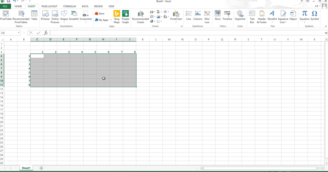
- Organize your data. Your data should be organized in three columns: one for the x-axis variable, one for the y-axis variable, and one for the z-axis variable. For example, if you’re plotting temperature and pressure over time, your columns might look something like this:
| Time | Temperature | Pressure |
|---|---|---|
| 0 | 20 | 1 |
| 1 | 25 | 2 |
| 2 | 30 | 3 |
| 3 | 35 | 4 |
| 4 | 40 | 5 |
- Select your data. Highlight all three columns of data.
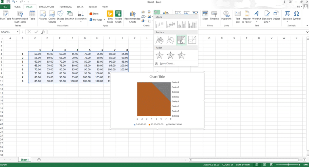
- Insert a 2D contour plot. Go to the Insert tab on the Excel ribbon, select the Charts dropdown, and choose the 2D contour plot option.
- Customize your plot. Once your plot is created, you can customize it in a number of ways. For example:
- You can change the colour scale to make the contour lines more visually appealing.
- You can add a title and axis labels to make your plot more informative.
- You can adjust the contour levels to show more or less detail in your data.

Organize your data in Excel
Customizing Plots in Excel
While Excel’s built-in contour plot tool is a great starting point, you may want to customize your plot further to make it more visually appealing or informative. Here are some tips for doing so:
- Change the colour scheme. By default, Excel uses a rainbow colour scheme for contour plots, but you may want to choose a different colour scheme that better suits your data or your audience.
- Adjust the contour levels. By default, Excel chooses the contour levels for you, but you can manually adjust them to show more or less detail in your data. This can help you emphasize important trends or patterns in your data.
- Add labels and annotations. You can add labels and annotations to your contour plot to highlight important features or provide additional context for your audience.
- Change the chart type. If you want to display your data differently, change the chart type. For example, you could create a 3D surface chart or a heat map instead of a contour plot.
Only 4 Easy Steps: Creating Plots in Excel
Step 1: Prepare your data
The first step in creating a contour plot in Excel is to ensure that your data is in the correct format. The data should be arranged in columns or rows, with each column or row representing a different variable. In addition, the data should be sorted in ascending order based on the value of the first variable.
Step 2: Insert a 3D Scatter Chart
Once your data is prepared, the next step is to insert a 3D scatter chart. This can be done by selecting the data and then clicking on the Insert tab. From there, select the Scatter Chart option and then choose the 3D Scatter option. This will create a basic 3D scatter chart, which we will modify in the next step.
Step 3: Add Contour Lines
To add contour lines to our chart, we must select the chart and click the Chart Elements button. From there, select the Contour option and choose the desired contour level. Excel will automatically generate contour lines for our chart, which can be customized further by adjusting the contour level or adding colour and shading.
Step 4: Format the Chart
The final step in creating a contour plot in Excel is to format the chart. This can be done by selecting the chart and then clicking on the Format tab. From there, you can adjust the chart title, axis labels, and other formatting options to create a professional-looking chart.
FAQs about Contour Plots in Excel
What types of data are best suited for contour plots?
Contour plots are best suited for data that varies across two dimensions and can be represented by a continuous range of values. For example, temperature and pressure over time or height and weight across a population.
How do I choose the right contour levels for my data?
Choosing the right contour levels depends on the nature of your data and what you want to emphasize. If you want to show fine detail, you may want to use more contour levels. If you want to emphasize broader trends or patterns, you may want to use fewer contour levels.
Can I add multiple data sets to a single contour plot?
You can add multiple data sets to a single contour plot by selecting the data from each set and creating a new contour plot. You can then overlay the plots on top of each other to see how the variables interact.
Conclusion
Contour plots are a powerful way to visualize complex data in an informative and visually appealing way. While they may seem complex at first, they are easy to create and customize in Excel. Following the steps outlined in this guide, you can create contour plots to help you gain insights from your data and impress your colleagues with your data visualization skills. So, experiment with Excel contour plots today and see what insights you can uncover!
Hello, I’m Cansu, a professional dedicated to creating Excel tutorials, specifically catering to the needs of B2B professionals. With a passion for data analysis and a deep understanding of Microsoft Excel, I have built a reputation for providing comprehensive and user-friendly tutorials that empower businesses to harness the full potential of this powerful software.
I have always been fascinated by the intricate world of numbers and the ability of Excel to transform raw data into meaningful insights. Throughout my career, I have honed my data manipulation, visualization, and automation skills, enabling me to streamline complex processes and drive efficiency in various industries.
As a B2B specialist, I recognize the unique challenges that professionals face when managing and analyzing large volumes of data. With this understanding, I create tutorials tailored to businesses’ specific needs, offering practical solutions to enhance productivity, improve decision-making, and optimize workflows.
My tutorials cover various topics, including advanced formulas and functions, data modeling, pivot tables, macros, and data visualization techniques. I strive to explain complex concepts in a clear and accessible manner, ensuring that even those with limited Excel experience can grasp the concepts and apply them effectively in their work.
In addition to my tutorial work, I actively engage with the Excel community through workshops, webinars, and online forums. I believe in the power of knowledge sharing and collaborative learning, and I am committed to helping professionals unlock their full potential by mastering Excel.
With a strong track record of success and a growing community of satisfied learners, I continue to expand my repertoire of Excel tutorials, keeping up with the latest advancements and features in the software. I aim to empower businesses with the skills and tools they need to thrive in today’s data-driven world.
Suppose you are a B2B professional looking to enhance your Excel skills or a business seeking to improve data management practices. In that case, I invite you to join me on this journey of exploration and mastery. Let’s unlock the true potential of Excel together!
https://www.linkedin.com/in/cansuaydinim/


