
So, you are regular excel user and know several formulas already. But in case you want some show for presentations and need cool charts, then it is time ask How to Create an Animation Chart in Excel? Animation can be a great way for this. You can use animation to make your charts more engaging and even create simple animations directly in Excel.
Table of Contents
How to Create Animated Charts in Excel?
Charts help you visualize your data so you will the most impact on your audience. Instead of presenting reports with flat and boring tables, impressive graphics can work better. Excel offers us many chart types at this point. Especially in Excel 2013 and later, it has become easier to create charts.
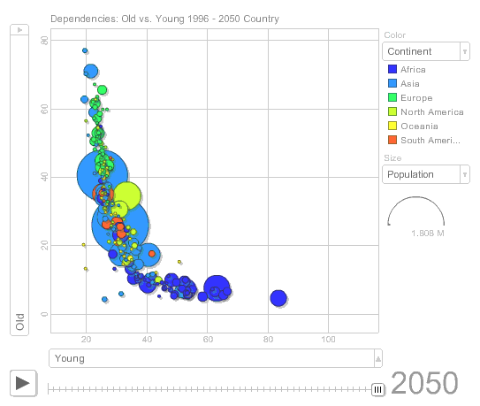
Excel Animation Chart
Now, by suggesting chart types suitable for our table, you can choose among various options. You can add chart titles and axis titles to any chart type. Axis titles can normally on all axes displayed in a chart. Including depth (series) axes in 3-D charts. Some chart types such as radar charts have axes but cannot display an axis title. You cannot add axis titles to charts without axes. Such as pie or donut charts.
How to Create an Animation Chart in Excel?
An animation chart is a great way to add some pizazz to your Excel spreadsheets. You can use them to add movement to otherwise static data. Or you can highlight important points in your data.
But you need to do a few things before you can create an animation chart in Excel. First, you should have a basic understanding of how animation works in Excel. And also , you need to have your data set up to allow you to create the animation. And it is time to create the animation itself.
Here’s a quick overview of each of these steps:
- In case you want to create an animation chart, you should understand how animation works in Excel. You can create them adding movement to a static object. In Excel, adding animation effects to cells or objects will work.
- Before creating an animation chart, you need to have your data set up to create the animation. This means having your data organized in a table or spreadsheet.
- Once you have your data, you can create the animation itself. This is adding animation effects to cells or objects in your spreadsheet. You can add as many or as few animation effects as you like tough.
Animation charts are a great way to add visual effects to your Excel spreadsheets. Following the steps above, you can easily create an animation chart for more praises.
Animations can make charts more engaging.
Adding animation to charts can help make them more visually appealing. This can be especially helpful when presenting data to an audience such as customers or managers. Excel makes it easy to add animation to charts and good part, the results can be amazing.
If you want to create an Animation Chart in Excel, you need to follow these steps:
- You should open a new workbook and enter the data you want to use for the animation. For this example, we will use a simple sales data set.
- Next, you should select the data and click the Insert tab on the ribbon. And now, click the Scatter chart and select the Scatter with Only Markers option.
- Now that your chart is here, it is time to add the animation. For that, you will go to the Animation tab and click Add Animation. In the dialog box, you should select Entrance, As One Object and then choose how you want the animation to appear. Such as coming “From Bottom”. You can also add a delay if you want before the animation starts.
- Once you added the animation, now you can go to the Preview tab and click Start Animation.
Simple animations can be created directly in Excel
Animation can liven up even the dullest of data presentations. Because adding a few simple animations to your Excel chart, you can level up your presentation. Best of all, creating animations in Excel is easy!
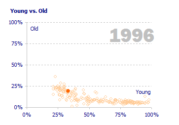
how to create an animation chart in Excel
Kids love animation. Here is a guide to help you make an animation chart in Excel to keep little ones entertained for hours. First, you will open up a new workbook in Excel and select the data you want to animate. Then, again you will go to the Insert tab and click on the Chart button. We recommend to choose one of the Pie charts such as 3D Pie for this project.
Examples: How to create a motion chart in Excel?
- Sub Animasyon3()
ActiveSheet.Shapes(“WordArt 3”).Select
m = 20
For i = 1 To m
Selection.ShapeRange.TextEffect.PresetShape = msoTextEffectShapeCurveUp
Next i
For i = 1 To m
Selection.ShapeRange.TextEffect.PresetShape = msoTextEffectShapeCurveDown
Next i
Selection.ShapeRange.TextEffect.PresetShape = msoTextEffectShapePlainText
Range(“a1”).Select
End Sub
If you want to make a cool animation chart in Excel, it’s pretty easy. You just need to follow a few simple steps.
Create a new Excel spreadsheet and input data for the Chart
Animations can liven up any data chart. And for sure, they are making it more visually appealing and easier to understand.
To sum up, you will create a new Excel spreadsheet and write data for the Chart. So here you should ensure to label each column and row so you know what information goes where.
2. Once your data is there, you will click on the Insert tab and select Chart from the drop-down menu.
Use conditional formatting to highlight specific cells, creating a ‘frame’ around the area: Can I animate a chart in Excel?
When you want to animate a section of your Excel spreadsheet, it is easy to do with conditional formatting. You can use this feature to highlight specific cells. This is about creating a ‘frame’ around the area you want to animate.
To do this, you will select the cells you want to include in the animation. And then you will go to the Home tab up there. In the Styles group, you will click Conditional Formatting and choose Highlight Cell Rules from the drop-down menu. Choose one of the options from the list that appears as you like.
Place a shape over the area you want to animate.
All you need to do here is place a shape over the area you want to animate and give it an initial position. Then, you can use the built-in Excel animation features to create your animated Chart.
Use excel’s animation feature: Excel graph animation
Animation can be a great way to and it’s not as difficult as you might think. If you want another article related to Excel, you can read 5 Tools to Help You Manage Your Business Data.

A dedicated Career Coach, Agile Trainer and certified Senior Portfolio and Project Management Professional and writer holding a bachelor’s degree in Structural Engineering and over 20 years of professional experience in Professional Development / Career Coaching, Portfolio/Program/Project Management, Construction Management, and Business Development. She is the Content Manager of ProjectCubicle.


