Excel Chart Wizard and Examples: A Comprehensive Guide
What is the Chart Wizard Icon Excel? If you are looking for a way to present your data in a visually appealing and easy-to-understand manner, look no further than Excel Chart Wizard and Examples. Excel is a powerful tool that can help you create dynamic and interactive charts, graphs, and other visual aids with just a few clicks. This comprehensive guide will explore the Excel Chart Wizard and its Examples, including its features, how to use it, and some real-life examples.
Table of Contents
Introduction: Excel Chart Wizard and Examples
Excel is a spreadsheet program widely used in business to manage data and perform calculations. However, Excel is much more than just a tool for organizing data. With its powerful charting tools, Excel can also create dynamic and interactive visual aids that help you analyze and present your data clearly and concisely.
One of the most powerful features of Excel is the Chart Wizard, which guides you through creating a chart, from selecting the data to choosing the type of chart to format the final product. With the Chart Wizard, you can create charts, including bar charts, line charts, pie charts, and more.
In this article, we will explore the Wizard and its Examples in detail, including its features, how to use it, and some real-life examples. So, whether you are new to Excel or an experienced user, this guide will help you get the most out of Excel’s charting tools.
Getting Started with the Excel Chart Wizard and Examples
Before diving into the details of the Wizard and Examples, let’s first look at how to start with Excel charts. To create a chart in Excel, you must have some data to work with. Once you have your data, you can follow these simple steps to create a chart:
- Select the data you want to include in the chart.
- Click on the “Insert” tab in the Excel ribbon.
- Click on the chart type you want to create.
- The Chart Wizard will appear, guiding you through creating your chart.
Now that you know the basic steps to create a chart in Excel, let’s look at the Chart Wizard and its features.
What is the Chart Wizard Icon Excel?
The Chart Excel is a tool that guides you through the process of creating charts in Excel. It is a step-by-step tool that helps you select the type of chart you want, the data you want to use, and the formatting options you want to apply. Chart Excel is designed to simplify the chart creation process and make it accessible to everyone, regardless of their Excel proficiency.
How to Access the Chart Wizard Icon Excel
Accessing the Chart Wizard Icon Excel is easy. Here’s how:
- Open Excel.
- Select the data you want to create a chart for.
- Click on the “Insert” tab in the Excel ribbon.
- Click on the “Charts” button.
- Select the type of chart you want to create.
- The Chart Excel will open, and you can begin creating your chart.
Using the Excel Chart Wizard and Examples
The Excel Chart Wizard is a powerful tool that can help you create professional-looking charts with just a few clicks. The Wizard guides you through creating a chart, from selecting the data to formatting the final product. Here’s how to use the Chart Wizard:
- Select the data you want to include in the chart.
- Click on the “Insert” tab in the Excel ribbon.
- Click on the chart type you want to create.
- The Chart Wizard will appear, guiding you through creating your chart.
Once you have started the Chart Wizard, you will have several options to customize your chart. Here are some of the key features of the Chart Wizard:
Selecting the Data
The first step in creating a chart with the Chart Wizard is to select the data you want to include. You can do this by clicking and dragging over the cells containing the data you want to include. Once you have selected your data, click on “Next” to continue.
Choosing the Chart Type
The next step in the Chart Wizard is choosing the chart you want to create. Excel offers a wide variety of chart types, including:
- Column charts
- Line charts
- Pie charts
- Bar charts
- Area charts
- Scatter charts
- Bubble charts
- Stock charts
- Surface charts
- Radar charts
- Combo charts
Once you have selected your chart type, click “Next” to continue.
Customizing Your Chart
After you have selected your chart type, the Chart Wizard will present you with a preview of your chart. From here, you can customize your chart by changing the title, labels, and formatting. The Chart Wizard also allows you to choose from a variety of chart layouts and styles to create a professional-looking chart that fits your needs.
Finalizing Your Chart
Once you have customized your chart to your liking, click on “Finish” to finalize your chart. Excel will insert your chart into your worksheet, where you can further customize it if necessary.
Excel Chart Examples
Now that we have covered the basics of using the Excel Chart Wizard, let’s look at some real-life examples of Excel charts.
Sales Figures
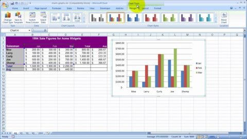
One of the most common uses of Excel charts is to present sales figures. In this example, we have a table of sales data for a company’s products. We can use the Chart Wizard to create a bar chart showing each product’s sales figures.
Budget Analysis
Excel charts can also be used to analyze budgets. In this example, we have a table of expenses for a company. We can use the Chart Wizard to create a pie chart showing the expense percentage for each category.
Project Timeline
Excel charts can also be used to create timelines. In this example, we have a table of tasks for a project. We can use the Chart Wizard to create a Gantt chart showing each task’s timeline.
FAQs about Excel Chart Wizard and Examples
- What is the Wizard? The Wizard is a tool that guides you through creating a chart in Excel.
- What types of charts can I create with the Excel Chart Wizard? Excel offers various chart types, including bar charts, line charts, and pie charts.
- Can I customize my chart using the Wizard? The Excel Chart Wizard allows you to customize your chart by changing the title, labels, and formatting.
- What are some real-life examples of Excel charts? Excel charts can present sales figures, analyze budgets, create timelines, and more.
- Is the Wizard easy to use? Yes, the Excel Wizard is designed to be easy to use, even for beginners.
- Can I create a chart in Excel without using the Chart Wizard? Yes, you can create a chart in Excel without using the Chart Wizard. However, the Wizard makes the process much easier and more efficient.
Conclusion: Excel Chart Wizard and Examples
Excel charts are a powerful tool that can help you analyze and present your data clearly and concisely. With the Excel Chart Wizard, creating professional-looking charts has never been easier. Whether a beginner or an experienced user, the Excel Chart Wizard and Examples can help you get the most out of Excel’s charting tools.
So, the next time you must present your data visually, remember the Excel Chart Wizard and Examples. With just a few clicks, you can create a chart that will impress your audience and help you communicate your message effectively.
Hello, I’m Cansu, a professional dedicated to creating Excel tutorials, specifically catering to the needs of B2B professionals. With a passion for data analysis and a deep understanding of Microsoft Excel, I have built a reputation for providing comprehensive and user-friendly tutorials that empower businesses to harness the full potential of this powerful software.
I have always been fascinated by the intricate world of numbers and the ability of Excel to transform raw data into meaningful insights. Throughout my career, I have honed my data manipulation, visualization, and automation skills, enabling me to streamline complex processes and drive efficiency in various industries.
As a B2B specialist, I recognize the unique challenges that professionals face when managing and analyzing large volumes of data. With this understanding, I create tutorials tailored to businesses’ specific needs, offering practical solutions to enhance productivity, improve decision-making, and optimize workflows.
My tutorials cover various topics, including advanced formulas and functions, data modeling, pivot tables, macros, and data visualization techniques. I strive to explain complex concepts in a clear and accessible manner, ensuring that even those with limited Excel experience can grasp the concepts and apply them effectively in their work.
In addition to my tutorial work, I actively engage with the Excel community through workshops, webinars, and online forums. I believe in the power of knowledge sharing and collaborative learning, and I am committed to helping professionals unlock their full potential by mastering Excel.
With a strong track record of success and a growing community of satisfied learners, I continue to expand my repertoire of Excel tutorials, keeping up with the latest advancements and features in the software. I aim to empower businesses with the skills and tools they need to thrive in today’s data-driven world.
Suppose you are a B2B professional looking to enhance your Excel skills or a business seeking to improve data management practices. In that case, I invite you to join me on this journey of exploration and mastery. Let’s unlock the true potential of Excel together!
https://www.linkedin.com/in/cansuaydinim/


