Bell Curve in Data Science: Tips, Tricks, and Expert Insights
In the ever-evolving landscape of data science, the ability to decipher the intricate patterns hidden within vast datasets is a coveted skill. Among the fundamental tools that empower data analysts to achieve this feat, the Bell Curve, also known as the Normal Distribution, stands tall. In this comprehensive guide, we embark on a journey to unravel the nuances of the Bell Curve in Data Science, equipping you with invaluable insights, techniques, and expert advice to seamlessly navigate and harness the power of data distributions.
Table of Contents
Key Points
- Mean: The “center” of the bell curve. In our example, it’s the average score of 70.
- Standard Deviation: Tells us how “spread out” the scores are. In our example, it’s 15.
- Z-Score: Tells us how far a specific data point is from the mean in terms of standard deviations.
- 68-95-99.7 Rule: In a normal distribution, approximately 68% of the data falls within one standard deviation of the mean, 95% within two, and 99.7% within three.
- Central Limit Theorem: If you have many samples, their means will form a normal distribution, even if the original data is not normally distributed.
Unveiling the Bell Curve in Data Science
A Statistical Marvel
The Bell Curve, at its essence, represents a statistical concept that beautifully encapsulates the distribution of data points around the mean. Its symmetrical structure follows the Gaussian distribution pattern, characterized by a peak at the mean with data gradually tapering off towards the tails. Also, this elegant curve finds applications across a spectrum of data analysis tasks, playing a pivotal role in everything from hypothesis testing to predictive modeling.
Significance of the Bell Curve
A Multifaceted Tool
The profound significance of the Bell Curve lies in its versatility, stretching its influential grasp across various domains. One of its paramount functions is to assess normality within datasets, granting researchers and analysts a reliable basis for informed decision-making. Also, its symmetrical nature not only simplifies complex calculations but also cements its place as a cornerstone of statistical analysis.
Core Characteristics of the Bell Curve
The Heart of the Curve
The Bell Curve proudly flaunts its defining characteristics, unraveling the intricacies of data distributions with unparalleled clarity:
Mean, Median, Mode Harmony
The harmony within the Bell Curve is evident as the mean, median, and mode converge at its center, highlighting its symmetric nature and the balance it brings to data distributions.
Unveiling the 68-95-99.7 Rule
An indispensable facet of the Bell Curve is the 68-95-99.7 rule, which simplifies the understanding of data spread. Also, it states that approximately 68% of data falls within one standard deviation from the mean, 95% within two, and an astonishing 99.7% within three standard deviations.
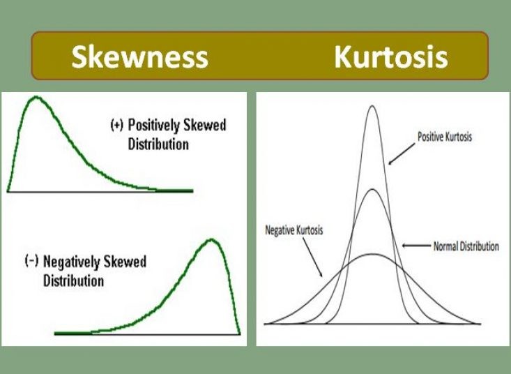
Perfect Symmetry: Skewness and Kurtosis
The Bell Curve’s impeccable symmetry is characterized by skewness and kurtosis values of 0. Also, these values affirm its adherence to a normal distribution, offering a reliable framework for analysis.
Example: Exam Scores
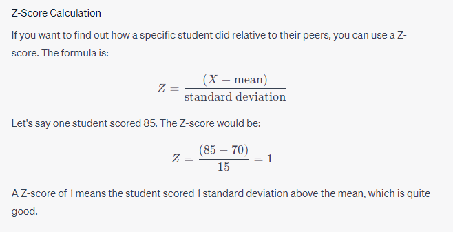
Let’s say a teacher gives an exam, and the class’s scores roughly follow a normal distribution. Here are some hypothetical scores:
Scores: 40, 45, 50, 55, 60, 65, 70, 75, 80, 85, 90, 95, 100
Assuming the mean score is 70 and the standard deviation is 15:
- About 68% of students should score between 55 and 85 (mean ± 1 * standard deviation)
- About 95% should score between 40 and 100 (mean ± 2 * standard deviations)
- About 99.7% should score between 25 and 115 (mean ± 3 * standard deviations)

Z-Score – Bell Curve in Data Science
Strategies for Mastering Data Distributions
Laying the Foundation
Embarking on the journey to master data distribution requires meticulous planning and execution. Here are the key steps to ensure success:
1. Data Collection and Pristine Cleaning
Prior to delving into data distribution analysis, ensuring the cleanliness and accuracy of your dataset is paramount. Also, outliers and errors have the potential to skew results and present an inaccurate distribution.
2. The Power of Visualization
Visualizations such as histograms and density plots prove to be invaluable tools in unraveling data distributions. Also, embrace libraries like Matplotlib and Seaborn to craft insightful visual representations.
3. The Language of Descriptive Statistics
A profound understanding of your data’s central tendency and dispersion is unlocked through the calculation of mean, median, and standard deviation. These initial statistics pave the way for deeper insights.
4. Embracing the 68-95-99.7 Rule
Leverage the power of this rule to identify data points within specific ranges. Also, it serves as a compass to navigate the vast sea of data, enabling the identification of anomalies and outliers.
5. Hypothesis Testing: A Gateway to Insights
The Bell Curve plays a pivotal role in hypothesis testing. The calculation of z-scores allows you to gauge the number of standard deviations a data point is away from the mean, facilitating the validation of hypotheses with precision.
Advanced Strategies for Profound Data Analysis
1. Deciphering Skewness
Recognizing and addressing skewness within the Bell Curve can unlock invaluable insights into underlying trends or data anomalies. Also, addressing skewness is a vital step to ensure the accuracy of subsequent analysis and model construction.

Deciphering Skewness
2. The Power of Transformations
In instances where data exhibits skewness, embracing transformations such as logarithmic or power transformations can bring the data closer to a normal distribution. This strategic move enhances the accuracy of subsequent analyses.
3. Central Limit Theorem: A Pillar of Resilience
The Central Limit Theorem, a cornerstone of statistical theory, bestows the power to approximate a normal distribution for sample means. This theorem remains resilient even when original data isn’t inherently normally distributed, bolstering the accuracy of your analyses.
The Central Limit Theorem (CLT) is intimately connected with the concept of a “bell curve,” which is a common term used to describe the shape of a normal distribution. When you graph a normal distribution, it forms a symmetric, bell-shaped curve.
Here’s how the CLT and the bell curve are related:
- Normal Distribution: Also known as the Gaussian distribution, this is what we commonly refer to when we talk about a “bell curve.” It’s defined by its mean and standard deviation , and it has the familiar bell shape.
- Sample Mean: Suppose you take samples from any distribution, calculate their mean, and then repeat this process a large number of times, storing each mean.
- Approximation by CLT: According to the Central Limit Theorem, as becomes large, the distribution of these sample means will approximate a normal distribution—even if the original variable is not normally distributed. This approximate normal distribution will have a mean equal to (the mean of the original distribution) and a standard deviation of (where is the standard deviation of the original distribution).
- Visual Representation: If you were to plot a histogram of all those calculated sample means, the graph would take the shape of a bell curve, assuming is sufficiently large.
- Practical Implications: Because many statistical tests assume normality, the CLT provides a way to apply these tests more broadly by using the sample mean as a “good enough” approximation of a normal distribution. This makes it easier to make inferences or predictions based on sample data.

Central Limit Theorem
Addressing Curiosities: FAQs about the Bell Curve in Data Science
Q: How Does the Bell Curve Aid in Outlier Detection?
A: The Bell Curve’s three standard deviation ranges serve as vigilant guardians in identifying outliers. Also, data points that fall considerably beyond these ranges warrant thorough investigation and consideration.
Q: Is the Bell Curve Solely for Large Datasets?
A: Contrary to misconceptions, the Bell Curve isn’t exclusive to extensive datasets. Also, it can be effectively applied to datasets of varying sizes, with its accuracy scaling as dataset size increases.
Q: Can the Bell Curve be Applied to Non-Parametric Data?
A: While the Bell Curve thrives in the realm of normal distribution, it offers insights into non-parametric data as well. However, it’s worth exploring alternative methods for more suitable analysis in such cases.
Q: Unveiling Normality: How Can I Determine if My Data Aligns with the Bell Curve?
A: Visual tools such as histograms and density plots hold the key to unraveling this mystery. If the visualization closely mirrors the symmetry of a Bell Curve, your data showcases a normal distribution.
Q: Beyond the Bell Curve: Are Alternatives Available for Data Distribution Analysis?
A: Indeed, alternatives like the Poisson distribution and the Exponential distribution cater to specific data types and scenarios, enriching the arsenal of data analysts.
Q: Embracing the Curve in Machine Learning: Is it Feasible?
A: Absolutely. Also, the foundational principles of the Bell Curve seamlessly integrate into a plethora of machine learning algorithms and models, enhancing their accuracy and robustness.
A Profound Conclusion
In the realm of data science, mastery over the Bell Curve empowers analysts to extract profound insights from the labyrinth of data. Also, its omnipresence in statistical analysis, this curve demystifies data distributions, laying the groundwork for enhanced decision-making, hypothesis validation, and predictive modeling. By assimilating the strategies and insights shared here, you embark on a journey armed with the prowess to confidently navigate the intricate terrain of data distribution analysis.
Hello, I’m Cansu, a professional dedicated to creating Excel tutorials, specifically catering to the needs of B2B professionals. With a passion for data analysis and a deep understanding of Microsoft Excel, I have built a reputation for providing comprehensive and user-friendly tutorials that empower businesses to harness the full potential of this powerful software.
I have always been fascinated by the intricate world of numbers and the ability of Excel to transform raw data into meaningful insights. Throughout my career, I have honed my data manipulation, visualization, and automation skills, enabling me to streamline complex processes and drive efficiency in various industries.
As a B2B specialist, I recognize the unique challenges that professionals face when managing and analyzing large volumes of data. With this understanding, I create tutorials tailored to businesses’ specific needs, offering practical solutions to enhance productivity, improve decision-making, and optimize workflows.
My tutorials cover various topics, including advanced formulas and functions, data modeling, pivot tables, macros, and data visualization techniques. I strive to explain complex concepts in a clear and accessible manner, ensuring that even those with limited Excel experience can grasp the concepts and apply them effectively in their work.
In addition to my tutorial work, I actively engage with the Excel community through workshops, webinars, and online forums. I believe in the power of knowledge sharing and collaborative learning, and I am committed to helping professionals unlock their full potential by mastering Excel.
With a strong track record of success and a growing community of satisfied learners, I continue to expand my repertoire of Excel tutorials, keeping up with the latest advancements and features in the software. I aim to empower businesses with the skills and tools they need to thrive in today’s data-driven world.
Suppose you are a B2B professional looking to enhance your Excel skills or a business seeking to improve data management practices. In that case, I invite you to join me on this journey of exploration and mastery. Let’s unlock the true potential of Excel together!
https://www.linkedin.com/in/cansuaydinim/


