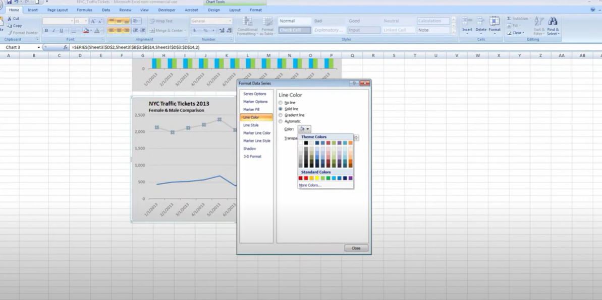
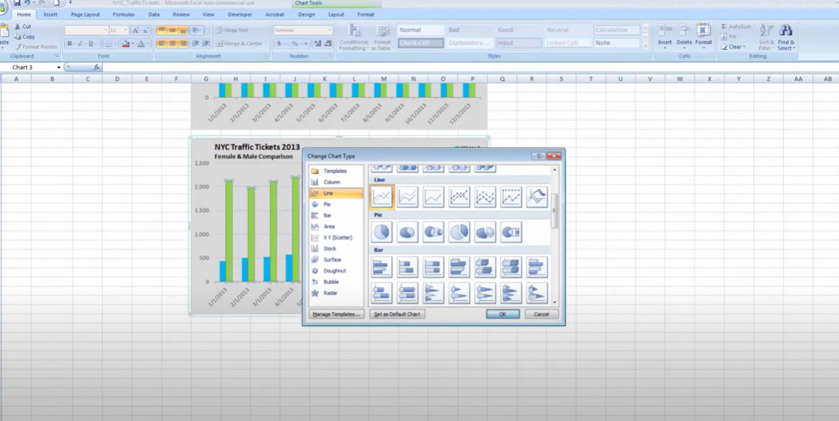
Ok, you got a line chart in Excel and wanted to change the style. Change a line chart is easy to do if you wonder it. Now below, you can learn how to change the style of your line chart in just a few clicks. You can create a solid or dashed lines with or without markers. If you get curious, then here are the steps to do it.
Table of Contents

how to change chart style in excel?
If you wanna change a line chart in Excel to a style, you can follow these steps:
- Firstly, you should select the line chart that you want to modify.
- Excel has Chart Tools tab. Here you should click on the Design menu.
- Now, you can select Change Chart Style option from the available options.
- A new window will open up with different chart styles. So you can choose whatever you liked.
- And voila, after you choose the style you want, you click on the OK button.
And that’s it actually. You have now successfully changed the style of your line chart in Excel.
What is the shortcut for changing chart style?
In Excel, you can change the style by using the following shortcut.
1. As always, you select the chart you want to change.
2. The shortcut version is Press Alt+F1 to open the Chart Tools menu.
3. Now, you can use the arrow keys to select most beautiful style.
4. Ok, it is time to press Enter to apply the new style.
How do you apply style seven quick styles to the chart?
There are a couple of different ways for it. But you can apply style seven to your chart. The first way is to right-click on the chart and select Change Quick Style. This will open up a menu of different styles for you. Here, you will simply select the style you want and then you can click OK.
how to change chart type in excel?
The second way to change the chart style is going to Design tab on top. Under this tab, you will find several different options for customizing your chart. One of these options is Chart Styles. Because clicking on this option will open up a menu of different styles for you. Again, you can select the most attractive one for you.
Can you change chart type in excel?
Yes, you can create your chart style in Excel. To do this, you will go to the Design tab again. And you will click on the Chart Styles option. This will bring you different styles. At the bottom of this, you will see an option saying Create New Quick Style. So, as a last move, clicking on this option will allow you to create your custom chart style.
How to Change the Chart Style in Excel?
In case you are sick of Excel’s outdated chart styles, you asked this question for sure. If you wonder how to alter the Excel chart style, good news you can do it. And it is quite easy.
Why you need morE style?
According to studies, visually attractive charts can improve audience engagement and understanding. Since people’s attention spans are shorter than ever, it is time to grab their interest right away. Your data may become more useful by learning how to alter the chart style in Excel.
how to change chart style in excel?
First of all you should find the chart you wish to embellish. When you click on the chart area, it will turn highlighted and become editable.
Now, you can go to the Excel window’s top and select the Design tab. This is the starting point for a vast array of customizable chart options.
Here you can select one of the charts and start changing their lines.
Changing Chart Color
When it comes to playing with chart types and design, we can change chart’s color when we are ok with the design. You will find the color option in the chart’s sidebar. It will appear when you click on the chart. After clicking on it in the style box, you can choose the color you want.
How to Format Charts in Excel?
When you are done with colors, there are other things you can do for designing.
Here you will format the chart in this stage. This will improve our chart and show data in a simpler way.
To include the Chart Title, you can Double-click on the Chart Title view. And then, you can type any title you want.
If you wanna include an axis to your chart, we must click the plus(+) icon next to the chart.
how do i change the chart style in excel for better look? Resizing Option
To resize and move change chart style in excel, you should just click on it to select it. Once it is highlighted, you will see small circles (or squares) around the edges. Here, you can click and drag these circles to make the chart bigger or smaller for chart styles in excel. If you want to move the chart around, then you will click anywhere inside the chart and drag it to where you want it.
Conclusion: how do i change the chart style in excel
Ok, we looked at how to change the style of your line chart in Excel. This is a great way to make your charts look more pro and more beautiful for you. We hope you found this tutorial helpful. Please let us know in the comments section below if you have any questions tough.

A dedicated Career Coach, Agile Trainer and certified Senior Portfolio and Project Management Professional and writer holding a bachelor’s degree in Structural Engineering and over 20 years of professional experience in Professional Development / Career Coaching, Portfolio/Program/Project Management, Construction Management, and Business Development. She is the Content Manager of ProjectCubicle.


